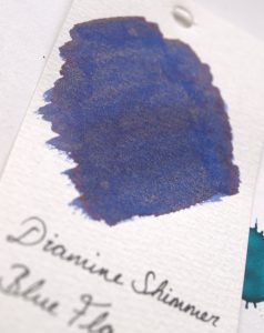
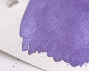
New Diamine Shimmertastic inks

The Diamine Shimmertastic inks range has recently been expanded with some new colours. As the marketplace for shimmer inks gets busier, these 8 new colours are a welcome addition. These are more unusual colours and shimmer pairings which, I think, will prove popular. Diamine kindly sent United Inkdom members samples of the new range to try out. Here’s my verdict in (approximately) spectrum order.

"<yoastmark

Arabian Nights

Arabian Nights
Arabian Nights

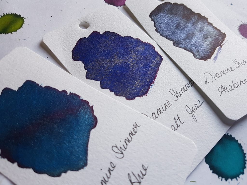
This is a particularly nice ink and a great addition to the Diamine Shimmertastic range. The base ink colour is a dark purple-black with blue tones. The shimmer is silver (it looks bluish to me but that might be a reflection of the ink itself).

Arabian Nights in Jinhao
Sparkling ink in a sparkling pen

This is the sort of ink that is practical as well as a little flashy. I’ve been using it in a Jinhao x750 and am enjoying the results. On the page, the ink is lovely. It’s nice and dark but with lots of character, and the shimmer works perfectly. Even in the fine nib of the Jinhao, the shimmer is set down evenly.

Clogging is a perennial fear in some quarters with shimmering inks. With these one from Diamine, I have found that if I leave the ink in the pen for several days without using it, I get hard starts. However, a few moments of work will get it going again. I’ve not experienced anything that could reasonably be called clogging.

Cobalt Jazz
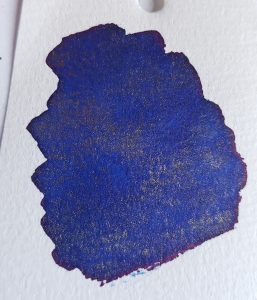
Cobalt Jazz
Cobalt Jazz

This is a lovely, cheerful cobalt blue with a slight red sheen visible at the edges. The shimmer is golden which works perfectly.

I was really impressed with the colour of this ink, and would be tempted to get some even if it didn’t have the shimmer. It’s similar to Diamine Majestic Blue, but the latter is a little darker. The red sheen, which I hope is visible in the photo, is subtle but wonderful.


Arctic Blue
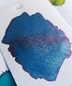
"<yoastmark

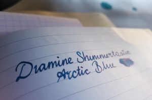
"<yoastmarkThe Arctic Blue swab was the single most impressive of the Shimmertastic inks. This ink is a cooler-toned blue than Cobalt Jazz, with a more pronounced red sheen. As you can see, the sheen showed not only at the edges but across the middle of the swab. The shimmer is silver.

I’ve been using this ink in a Lamy Al-Star with a 1.1 stub nib. Again, it  caused a few hard starts if left for several  days, but no clogging. The 1.1 nib helped to show off the sheen and shimmer of this ink. It’s definitely one which benefits from a nib that puts down a lot of ink. When writing, some papers show up the red sheen particularly well (Tomoe River paper being the obvious candidate).

"<yoastmark

Spearmint Diva

Spearmint Diva
Spearmint Diva
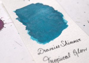
Tropical Glow
Tropical Glow

Spearmint Diva is a bright blue-green with silver sparkle. There’s a slight hint of dark red sheen at the edges too. It’s similar to another Diamine Shimmertastic: Tropical Glow. Spearmint Diva is more green than that though. It’s also similar to Diamine Marine, one of my favourite inks, though the latter does not have shimmer or any sheen.

It’s no secret that I’m a big fan of these blue-greens, teals, and peacock colours. Spearmint Diva is no exception.

Golden Ivy

Golden Ivy
Golden Ivy
Golden Ivy
Golden Ivy

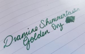
This is a rich green ink with gold shimmer. Again, this ink has some sheen visible at the edges of the swab. I haven’t found that it shows up when writing, even with Tomoe River paper, but others may have more luck.

Diamine Shimmertastic range has another green ink with gold shimmer, Golden Oasis, but the new Golden Ivy is a darker ink.
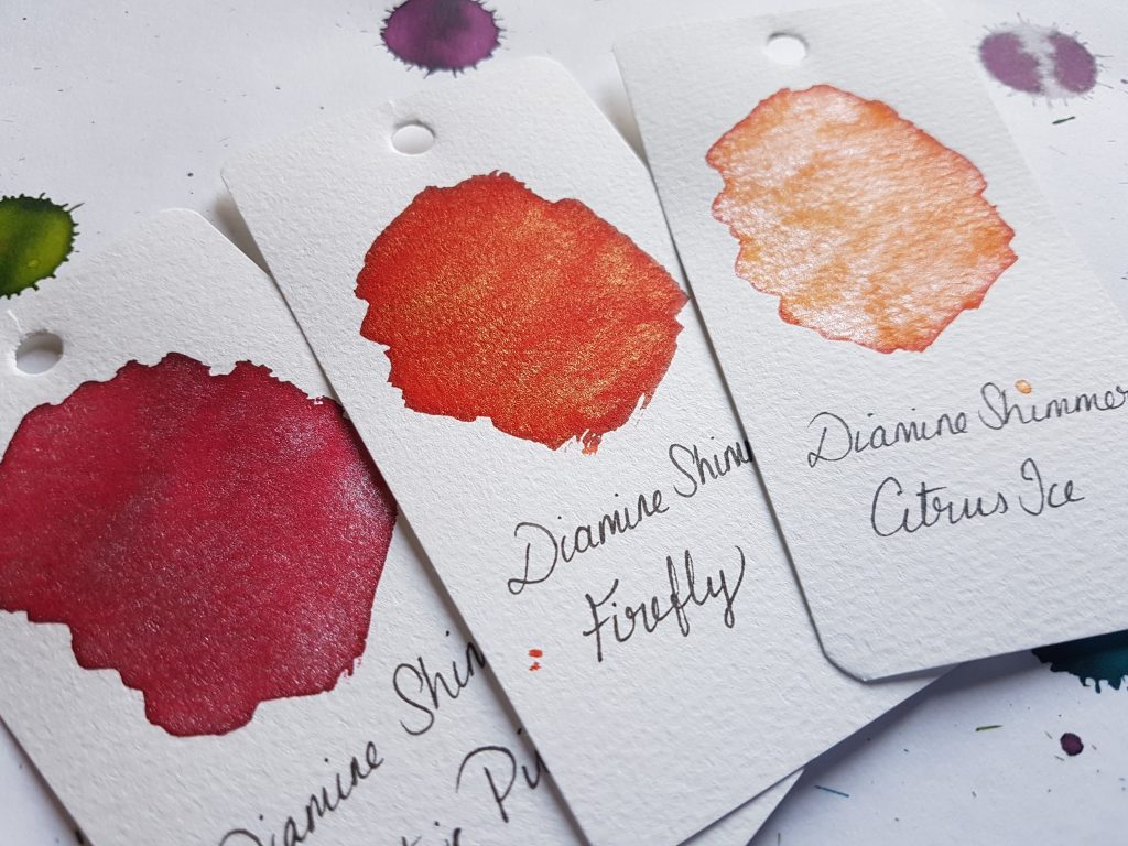
Electric Pink, Firefly, Citrus Ice

Citrus Ice

Citrus Ice
Citrus Ice
Citrus Ice
Citrus Ice

Citrus Ice is a gorgeous, warm orange with silver shimmer.  The combination of orange in silver is unexpectedly pretty.

Firefly
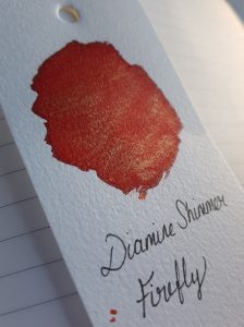
Firefly
Firefly

Firefly is just gorgeous! It’s a saturated red with gold shimmer. It’s warm and rich, very slightly orange-toned.

Frosted Orchid, Wine Divine, Firefly

Wine Divine

Wine Divine
Wine Divine

Wine Divine is another lovely colour. It’s a dark, wine red (as you might expect) with gold shimmer. The ink itself is a lovely warm burgundy colour. Diamine already do a mean range of wine-coloured inks. My current favourite is Syrah, but there’s also Claret and Merlot. Wine Divine is a great addition to that cellar.

Electric Pink
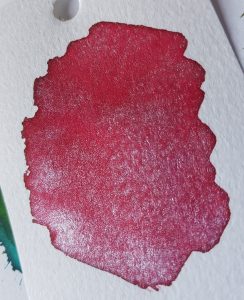
Electric Pink
Electric Pink

Pink is a colour you either love or you hate, it seems. I’m not fond. That said, this is probably the most tolerable pink ink I’ve seen. It’s a strong, saturated colour that’s on its way to red. The silver sparkle in it works well.

Frosted Orchid
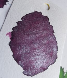
Frosted Orchid
Frosted Orchid

This is a lovely red-toned purple ink. It’s darker than I expected with a name like “orchid” but that might just be me! The silver shimmer definitely gives it a “frosted” look. The contrast of the warm ink colour and cool shimmer (as with some of the other Diamine Shimmertastic inks) works really well.

I can imagine this would be a popular festive ink for those wanting to avoid red, green, and gold.

Overall, these inks offer genuinely interesting additions to the Diamine Shimmertastic inks range. The variety and interesting sheening properties, combined with great value for money (a 50ml bottle costs £8.95), makes these a really good option for adding some sparkle to your writing.

de Atramentis Pearlescent Inks

Sparkling and shimmering inks are  a Big Deal right now. It started with J. Herbin’s 1670 Anniversary ink, Haematite, which is a lovely, deep red with a subtle gold shimmer. Further Anniversary inks followed. Most notable of these was Emerald of Chivor, an amazing dark teal with red sheen and gold shimmer. Diamine brought out some of their own shimmering inks a few years after Herbin, some of which I reviewed here. Now de Atramentis are getting in on the act, with their own pearlescent inks.

So, if shimmer inks are a big deal, are we reaching saturation point? (Excuse the pun.)  Well, de Atramentis have introduced a little innovation here. Herbin and Diamine have produced ink with a complimentary shimmer colour, but de Atramentis offer a choice of shimmer. Each of the ten ink colours in the pearlescent range is available with gold, silver, or copper shimmer.

The first thing that I noticed on making ink swabs was the sheer amount of shimmer particles in this ink. There is so much more than Herbin or Diamine inks. For many people, this will come as good news. This shimmer is not subtle!

A word on pen hygiene. Many people are reluctant to put shimmer inks in their pens for fear of clogging. I am not overly concerned about this, but I don’t tend to put this in my best pens. I have never had a problem with clogging in my Lamy Al-Stars though, even when I’ve left it in them unused for weeks. The significantly higher concentration of shimmer particles in these inks may make me a bit more reluctant to leave it in pens for a long time.

De Atramentis have kindly offered United Inkdomsome samples of these inks for review. Pure Pens carries some of the colours to buy.

Heliogen Green

The base ink here is a medium green which works well with all three of the pearlescent shimmers.

Heliogen Greens
Heliogen green with three different finishes

As you can see from the picture, the different coloured shimmer makes quite a difference to the look of the ink.

Heliogen Green Copper
Heliogen Copper
Heliogen Green with Copper

The contrast of the warm copper and green is really lovely and quite unusual. The de Atramentis inks have a LOT of shimmer particles in them so the effect is easy to see, especially so with this combination. I am not sure this is something I would have bought had I not seen it in action first. However, having used it, I am pleasantly surprised at how well the combination works.

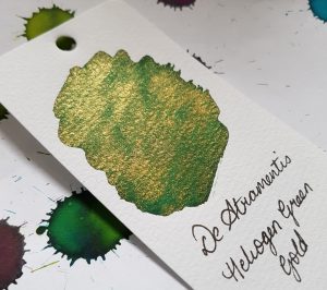
Heliogen Gold
Heliogen Gold
Heliogen Green with Gold shimmer

This is another lovely contrast of warm and cool.  It is less strikingly unusual and could be compared it to Diamine’s Golden Oasis.  Diamine’s offering uses a lighter coloured ink and has a more subtle shimmer, though.

Heliogen Silver
Heliogen Silver
Heliogen Green with Silver shimmer

Green and silver are a nice combination, and to my mind, a bit festive.

Cyan Blue

Cyan Blue
Cyan Blue with three finishes

The base ink here is not accurately described as cyan, but is a lovely royal blue.

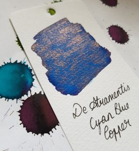
Cyan Copper
Cyan Blue Copper
Cyan Blue with Copper shimmer

The Copper shimmer again proved to be a successful and surprising combination. The contrast between the blue and the orange copper is beautiful.


Cyan Gold
Cyan Blue Gold
Cyan Blue with Gold shimmer

The blue and gold is beautiful too, and reminiscent of Ancient Egyptian art with its use of gold and lapis lazuli. A sort of Ink of the Pharaohs?

Early use of Cyan Blue Gold

This was my favourite of the samples I tested.

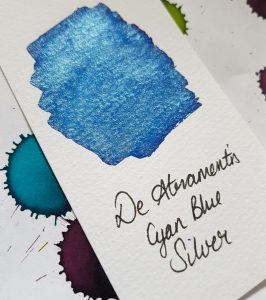
Cyan Silver
Cyan Blue Silver
Cyan Blue with Silver shimmer

The silver shimmer works really well with the blue ink. It looks like an icy pool in the swab sample. The colours compliment one another very well.

Like the green, the blue and silver combination really shows how much shimmer these inks have.

Brilliant Violet

Brilliant Violet
Brilliant Violet with different shimmers

I expected to like the Brilliant Violet inks more than I actually did. I didn’t feel that any of the shimmer colours went well with the shade of ink.

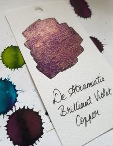
Brilliant Violet Copper
Brilliant Violet
Brilliant Violet with copper shimmer

The contrast between the purple ink and copper shimmer did not do it for me. Unlike the contrast with this shimmer and both the Green and Cyan ink, this created a bit of an odd ink that I can’t imagine ever wanting to use.

Brilliant Violet Gold
Brilliant Violet with Gold shimmer

This is nicer than the Copper. Purple and gold are a classic pairing.

Brilliant Violet Silver
Brilliant Violet with Silver shimmer

Purple and silver are also a good pairing, and I’m sure this ink will have some fans.

Amber

Amber Gold
Amber with Gold shimmer

I only have a sample of Amber with Gold, so I can’t compare to the other shimmer colours, but it’s rather lovely. It looks very pale and transparent when the ink first goes down on the paper but it dries quickly to a lovely warm yellow. The gold shimmer with that shade is quite beautiful.

Taroko Design A5 notebook

The Taroko A5 notebook is a great way to get a hold of some Tomoe River paper at a less-than-eye-watering price. For fountain pen enthusiasts, Tomoe River paper needs little introduction. It’s super lightweight but resists feathering and bleed-through like a much heavier paper. Through some paper alchemy, it’s also fantastic at showing off the sheen of inks.

The Taroko Design notebook uses this legendary paper. Bureau Direct were kind enough to send some of us United Inkdom reviewers a sample notebook to take for a test drive. The one I’m reviewing here is the A5 size with lined paper. It’s also available in traveler’s notebook sizes, with plain and dot grid paper.

Details

  • The notebook is proper A5 proportions so will sit nicely with an A5 traveler’s notebook or alongside a Leuchtturm or other A5 notebook.
  • It contains 64 pages (32 sheets) of paper
  • It’s made with 62gms Tomoe River paper which is the slightly heavier of the two weights this paper is usually found in.
  • It’s staple bound
  • Price: £7.95

This isn’t a cheap notebook at £7.95 but the premium price is due to the premium paper. Tomoe River isn’t easy to get a hold of in Europe

Appearance

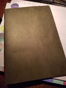
The notebook isn’t much to look at from the outside. The lined version has a black cover (the dotted is brown and the plain blue). It’s a sugar (construction) paper cover which won’t take a lot of battering about. It’s clearly designed to be used with an additional cover. As it is, this won’t protect the insides from folding, tearing, spills or general bashing. It does keep the total weight and width down though.

Taroko A5 cover
Uneventful

Inside

I’d never normally choose lined paper if dot grid or even plain was available. The lines are never the right width! The Taroko lines are a comfortable 7mm apart. Were I to buy one, I’d still choose dot grid, but I found the lined to be surprisingly pleasant.

Taroko A5 cover
Its lined but I still love it


Writing

The real pleasure with Tomoe River paper is the writing experience. The paper is smooth and light. Fountain pen ink can take a little longer to dry on this paper so be prepared for that. But also be prepared to see your ink like you’ve never seen it before.

I can also say, as someone who harbours the guilty pleasure of writing with ballpoint pen on sugar paper, this notebook would also be fun with ordinary pens.

Taroko A5 cover
Herbin Caroube de Chypre- look at that shimmer!


UPDATE:

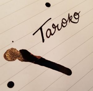
I dropped some ink on the notebook while writing this review, just to see how it handled it. 12 hours later (TWELVE HOURS) it’s still not quite dry. Of course, this isn’t the usual amount of ink a pen, even a wet pen, would put down. Left-handed writers might want to think twice about this paper.

Sloooow drying times
The tail of the drop is still wet 12 hours later!

Verdict

I really like this notebook but with some caveats. It is an absolute pleasure to write on. However, at £7.95 it’s a bit pricey. I suspect this would make me hesitant to use it and it might sit around for rather a long time while I waited for the perfect use for it. The soft cover also means that it would be better used inside an additional cover to protect it. All that said, Tomoe River paper is unparalleled and this notebook is a great way to try it out without the exorbitant shipping costs that come with buying from abroad.

Platinum Classic Iron Gall inks

I love ink. One of the main reasons I love fountain pens is that I have a virtually limitless selection of ink colours available to use with these pens. However, I also realise that practicality plays a part. Much as I like unusual, light coloured inks, I don’t use them as often as I use darker or stronger colours. I’m fortunate in that, as a PhD student and university teacher, what I can deem “practical” is much broader than people in many (perhaps most) other fields. I am always excited when I see new inks which combine interest with practicality though. I was therefore delighted to receive samples of Platinum Classics inks to review.

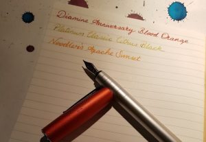
Citrus Black with the Lamy Charged Green Al-Star

Platinum have recently released a set of six inks which have some interesting and unusual properties: the Classic blacks range. These inks are “made by a traditional Japanese method which only Platinum still use.” They are iron gall inks and so oxidise over time so the ink darkens. The change is visible initially, especially if you put a lot of ink down on the paper. As it dries, it darkens dramatically. This process of darkening continues less visibly over a longer period.

Platinum Classic inks
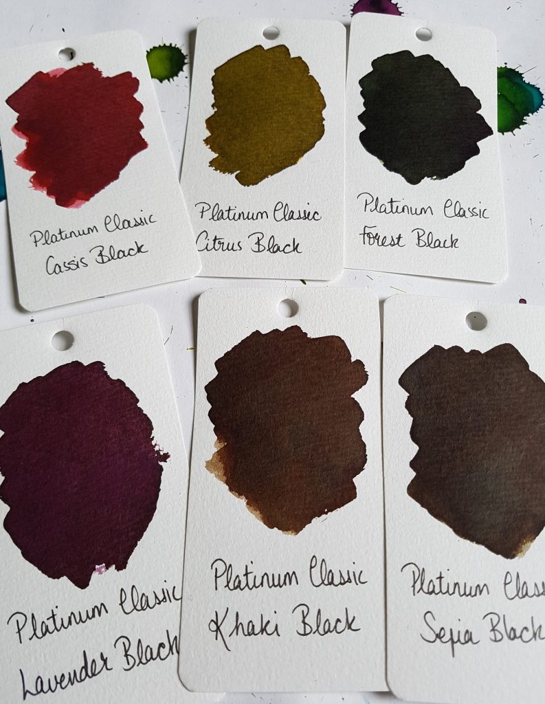
Platinum Classic ink swatches

Cult Pens, on e of my favourite source for all things stationery, sent United Inkdom some inks to test out for review. You can see the products here. There are six colours in the Platinum Classics ink range: Citrus Black, Cassis Black, Forest Black,Khaki Black, Lavender Black, and Sepia Black. They are available from Cult Pens for £21.99 per bottle.

Cassis Black

Cassis Black starts out, unsurprisingly enough, the colour of blackcurrant juice, a bright pink-red. It dries to a deep pinky red. I am not a fan of pink at all, but this colour has enough depth to appeal to me regardless. I can see a bottle of this becoming the only pink ink in my collection.

Cassis Black
Platinum Classic Cassis Black

Citrus Black

Citrus Black is an unusual colour, which reminds me slightly of J. Herbin Vert Olive. Unfortunately, I don’t have a bottle of Rohrer and Klinger Alt-Goldgrun which I think might be the closest comparison. Citrus Black starts off a bright yellow with green tones, and dries to a dark greenish gold. It’s one of the most dramatic of the colour changes because it starts off so light in colour. I’ve been getting more and more fond of these sorts of acid greens lately and I like Citrus Black a great deal.

Citrus Black
Citrus Black swatch


Forest Black

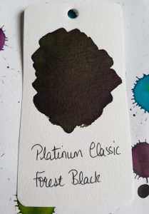
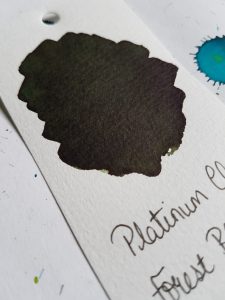
Forest Black is a dark, deep green which changes the least in the initial minutes of oxidation. It starts off dark and gets a little darker over time. There’s a depth to this colour, like all the Platinum Classics, which gives this colour a real richness. In a pen, especially with a fine or extra-fine nib, I think it would be difficult to distinguish this colour from black. That in itself might make it appealing.

Forest Black
Forest Black
Forest Black
Forest Black

Khaki Black

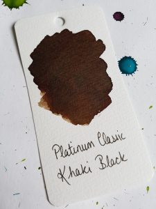
Khaki Black is a deep, rich warm brown (and not very khaki-like at all, in my opinion). It’s very deep and reminds me of leather- it looks like it should be warm and supple to the touch. I don’t have much need for brown inks, but this is lovely and, like the Cassis Black, I can see it becoming an exception to my (not at all strict) rules. The swatch below also shows the shading of this ink, where a single pass with the brush in the lower left is a much lighter colour.

Khaki Black
Khaki Black

Lavender Black

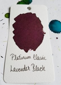
I suspect Lavender Black will be the general favourite of these inks. It’s a deep red-purple and reminds me of Diamine Tyrian Purple, but Lavender Black is richer and deeper. I think this will prove to be a popular addition to all those purplophiles’ collections (that’s totally a word).

Lavender Purple
Lavender Purple

Sepia Black

Sepia Black, like Forest Black, starts out dark and darkens further as it is exposed to the air. This is a very dark brown, almost black but it’s slightly cooler toned than Khaki Black, with the tiniest hint of green. The depth of colour, again, could tempt me to get some brown ink after all.

Sepia Black
Sepia Black

Iron Gall Inks

"<yoastmark

Medieval manuscript
Iron gall ink damage to a medieval illuminated manuscript

As a historian, I find iron gall inks both fascinating, and worrying.

Historically, scribes made this ink by extracting tannic acid from oak galls (caused by gall wasp larvae on trees), mixing it with iron sulphate and binding it with gum arabic (there are variations on this recipe). The result was a very dark purple or brown ink which darkened over time as the iron oxidised. It was easy to make and water resistant so it became very popular in the Middle Ages. It was eventually replaced, after nearly 2000 years of use, in the twentieth century when other waterproof inks were developed.

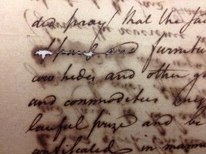
Medieval and Renaissance iron gall inks sometimes damaged the paper on which they were used. This damage takes a long time to take effect, but has, in the worst cases, destroyed the manuscript. The acidity of the ink could eat through the paper and cause it to disintegrate. This is well illustrated in the image to the left, where the ink has eaten through the manuscript almost everywhere it was in contact with the paper or parchment.

Fortunately, modern iron gall inks are made to a different recipe and should not cause any damage to paper, or fountain pens. Modern manufacturers are aware of the potential pitfalls and have compensated, using different acids which are fully oxidised on contact with the air so they don’t damage the paper. That being said, Cult Pens recommends not leaving Platinum Classics inks in your fountain pens for extended periods of time so be aware. It’s better safe than sorry, especially with a beloved pen!

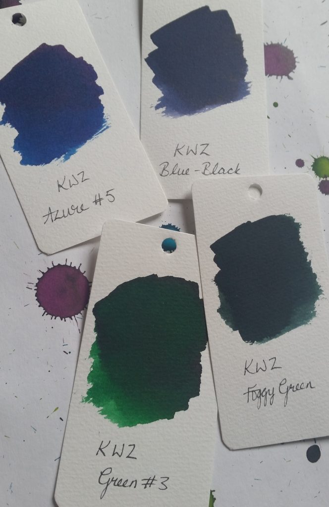
KWZ ink: Azure #5, Green #3, Foggy Green, Blue-Black reviews

I delightedly receivved some samples of KWZ ink from the lovely people at Pure Pens as part of a meta-review for United Inkdom. KWZ inks are made by Chemistry PhD student Konrad Żurawski in Poland and come in a variety of colours and types, including iron gall and waterproof varieties. I’m reviewing some green and blues here.

KWZ inks
KWZ blue and green inks

Azure #5

Azure #5 sample
Test of Azure #5 with glass dip pen

Azure #5 is surprisingly dark for the title “azure” but it’s a lovely, saturated dark royal blue. It reminds me of Diamine Majestic Blue but without the red sheen. It’s definitely a colour that you could use for more formal situations where a restrained, but still a little interesting, ink is called for. It’s a nice, wet ink, but I don’t see it replacing Majestic Blue for me.

KWZ Azure #5
KWZ Azure #5 swab on watercolour paper

Green #3

KWZ Green #3
KWZ Green #3

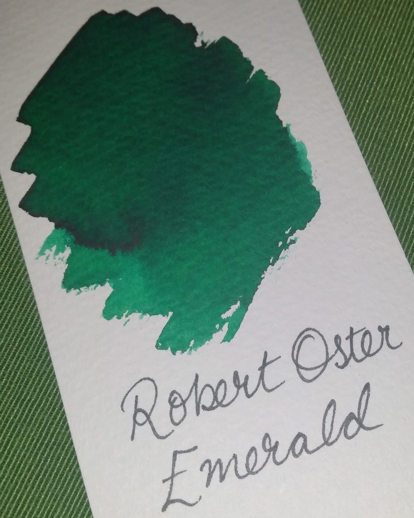
Again, this is a nice, solid dark-ish green without sheen. There’s some nice shading with it, and it’s free-flowing and wet. It’s not hugely exciting though. It’s a little darker and less blue-toned than Robert Oster Emerald, as you can (hopefully!) see from the side-by-side below.

KWZ Green #3
KWZ Green #3
Robert Oster Emerald ink
Robert Oster Emerald


Foggy Green

KWZ Foggy Green
KWZ Foggy Green

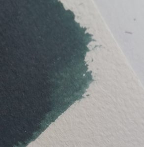
Foggy Green is a far more unusual ink than the previous two. It’s difficult to describe, and I suspect the pictures don’t convey how it really looks. Even the name doesn’t suggest, to me at least, the real colour. It’s a very dark green, with a grey rather than black tone. The written sample (using a glass dip pen) is very dark, but still definitely grey-green rather than black. The grey tone is more apparent in the swab below, and is what stops it seeming black.

KWZ Foggy Green
KWZ Foggy Green swab on watercolour paper
KWZ Foggy Green
KWZ Foggy Green: close up

Blue-Black

I’m not a blue-black fan. I’ve tried a few (Diamine Twilight, Pelikan Edelstein Tanzanite) but can’t quite get on board. I like my blacks to look like the staring void. I like my blues bright and interesting. Blue-blacks are the worst of both worlds. However, I was pleasantly surprised with KWZ Blue-Black.

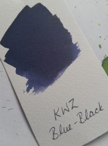
KWZ Blue-Black
KWZ Blue-Black

Like Foggy Green, it’s a grey-toned colour, but very dark in the glass pen writing sample. The colour of the swab shows the lovely shading of this ink best.

KWZ Blue-Black
KWZ Blue-Black

My one concern about KWZ inks is the smell, though. Foggy Green and Blue-Black in particular smell very strongly. It disappears by the time the ink dries on the paper, but the wet ink reeks. Even just opening the sample bottles (which contain about 4ml of ink) releases a horrible chemical smell. It’s a strange, plasticy, synthetic smell that lingers for a few minutes after filling the pen. It’s off-putting, but at least it doesn’t last.

Robert Oster Signature Inks Claret and Emerald review

There’s been some buzz around Robert Oster inks recently. Made in Australia, they’ve been difficult to find in Europe and North America until recently. In the UK, you can buy them from Izods Ink, who kindly sent samples for this and the other reviews for United Inkdom.

I received Claret and Emerald to review. I’ll confess that when I first received these ink samples, and did a quick swatch of each to get an idea of the colours, I was underwhelmed. Both of them seemed dull and lacking vibrancy. I had hoped that the Emerald would be a bright, dark green, and the Claret a rich red purple. The swatches showed an unexciting dark green, and a dark, greyish purple. Revisiting them a few days later, and creating new swatches, I find I’ve warmed to them a little.

Robert Oster Claret

Robert Oster Claret swatch

Of the two, I was most keen to try Claret. I always like purples and dark reds, and I hope this would fall into both categories.

It’s dark indeed, and has some depth. I didn’t seem any shading when I tested it with a glass pen but you can see there’s quite significant variance in colour from the swatch. I bold- or stub-nibbed fountain pen might make this clearer.

Robert Oster Claret writing sample


Robert Oster Emerald

Emerald has really grown on me. Although I didn’t find it very exciting at first, on my second look at it, I appreciate the richness and jewel-tones of this ink. As you can see from the photo, there’s a huge variation in the colour: from bright green to almost black. As with the Claret, this wasn’t visible with the glass pen, but will be with a fountain pen using a broad or stub/italic nib. Anything which puts down a lot of ink should show this shading.

Robert Oster Emerald writing sample


Verdict

These are nice inks, and have great shading potential. The Claret is a little unexciting, but the Emerald is lovely. I can see me using both, though I doubt I’d buy Claret as Diamine Grape and Tyrian Purple, and Pelikan Edelstein Amethyst cover all my dark purple needs. I don’t have anything quite like the Emerald though, so that’s one I’d consider. The other United Inkdom reviews show that the Robert Oster teal and turquoise inks are pretty special- and I am keen to try out Fire and Ice which looks pretty special.
 

[Please excuse the rather dark pictures. It’s been a very dark and gloomy weekend in Edinburgh and there’s just not been enough natural light to take good photos!]

Diamine Shimmertastic Inks review

I was excited to receive four bottles of Diamine’s new Shimmertastic inks to review. This is part of a meta-review from United Inkdom.

I was sent:

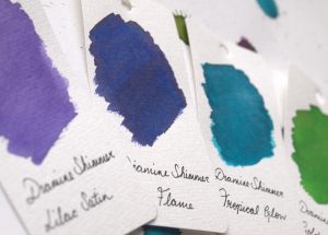
Swatches of four Diamine Shimmertastic inks
Shimmertastic Ink swatches
  • Golden Oasis
  • Tropical Glow
  • Blue Flame
  • Lilac Satin

I was particularly happy to get my hands on Tropical Glow, as I love teal and turquoise inks, and Golden Oasis as I am also very fond of this shade of green.

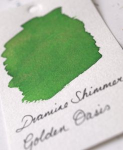
Golden Oasis

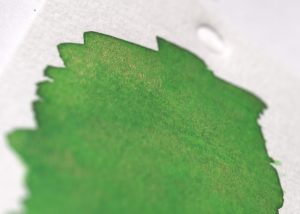
This is a mid-green with golden shimmer. It proved to be one of my favourites of this set. It’s a cheerful, leafy green which isn’t a million miles away from Diamine Meadow. The golden shimmer is subtle but visible. The particles are very fine and a gentle agitation is all that’s required to stir them up if the pen has been lying unused for a while.

Golden Oasis swatch
Golden Oasis swatch

It’s difficult to capture the sparkle of this ink with a camera, especially in Scotland in late December when there’s not a whole lot of natural light to reflect.

Gold particles visible
Golden Oasis on Tomoe River Paper
Golden Oasis on Tomoe River Paper from a Hobonichi Techo Cousin diary


Tropical Glow

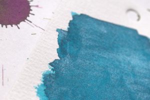
This is a beautiful deep turquoise ink with silver sparkle. The ink alone is almost identical to Diamine Marine, my favourite every day ink. It’s brighter than Yama Dori and without the amazing sheen of that ink, but as a result is a more usable ink. The silver shimmer, like the gold, is fine but catches the light well.

Tropical Glow swatch
Silver sparkle in Tropical Glow


Tropical Glow on Tomoe River Paper


Blue Flame

Blue Flame is a deep blue with gold shimmer with a hint of red sheen. I found it to show the shimmer the best of the four, perhaps because it is the darkest ink and contrasts the sparkle better.

Blue Flame swatch
Blue Flame swatch
Blue Flame with golden particles
This looks like a chunk of lapis lazuli
Blue Flame on Tomoe River Paper

Lilac Satin

This is a light, bright purple with silver shimmer. I expected to like this more but perhaps it was just that it is too light for me. It is a colour lots of people will love though.

Lilac Satin swatch
Lilac Satin swatch
Silver sparkle in Lilac Satin
Lilac Satin on Tomoe River Paper


These are lovely inks and I will definitely be investigating some of the other colours in this range. They are not as spectacular as Herbin’s Anniversary inks but they are consequently more usable. They are affordable for everyday use and the sparkle is subtle enough to brighten up your writing without making it look like there was an explosion in a glitter factory. Only Blue Flame showed any sheet and the shading is minimal on all four.