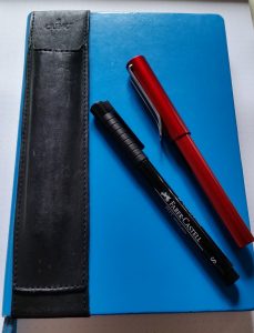
The manufacturer lent me a Kaweco Lilliput Fireblue fountain pen for an honest review. This is a pen I’d had my eye on for a while due to its unusual looks. I’m not a big fan of Kaweco’s more popular Sport pens- there’s something about the shape I’m just not fond of, but the sleek lines of the Lilliput are very appealing. I decided to do this a little differently, and take a leaf out of Scribble’s book, by writing my review by hand but my camera, unaccustomed to the bright light of sunshine we’re currently experiencing, couldn’t get a good shot of the text. Instead, I’ve had to capture it as a document, and the ink colour is all wrong! The review was written on the California State notebook reviewed here.
First off, the pen comes in a nice little tin. That said, you wouldn’t carry it around in this as there’s nothing to secure the pen inside. It’s pretty though.
Kaweco tin
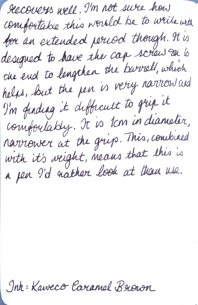
As you can see, my writing is pretty scruffy here. I found the Lilliput difficult to hold comfortably and my writing suffered as a result. Fountain pens should be a pleasure to use and this just wasn’t. I can still feel a slight ache between my right thumb and index finger after 10 minutes or so of writing with it. My hands are about average size for a woman, I would say, so I think you might have to have very delicate hands to find this pen comfortable, assuming the weight of it didn’t bother you.
Kaweco Lilliput Fireblue
This is a really beautiful pen, and my crummy photographs don’t do it any justice, but I would caution you to try it before you buy. There’s no way I would be sending this loaner back to Kaweco if this were a standard sized pen! As it is, I know I’d never use it. I’d just gaze regretfully at it.
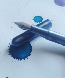
The lovely Stu over at Pocket Notebooks sent some United Inkdom members a bumper pack of small notebooks to review. I received a really nicely presented box containing 6 approx. A6 notebooks, and a tiny wee Silvine.
Pocket Notebooks box (including a little ‘sweetener’)Notebooks!
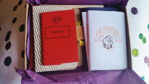
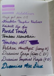
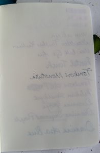
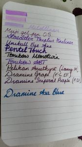
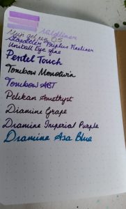
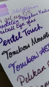
All of these notebooks should be able to handle fountain pens, so I decided to put the manufacturers’ claims to the test with a variety of pens and inks. I selected a variety of purple inks for no particular reason except I like purple. Here are the pens I used:
From bottom to top (the order used in the tests):
The selection of mostly) purple pens used to put these notebooks through their paces
Stabilo Boss purple highlighter
Stabilo Boss pastel purple highlighter
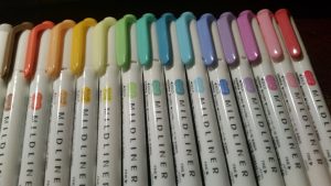
Zebra Mildliner soft purple
Muji gel pen (0.5mm)
Staedtler Triplus Fineliner
Uni-ball Eye (fine)
Pentel Touch brush sign pen
Tombow Mono Twin
Tombow ABT (636 Imperial Purple)
Lamy Safari fountain pen, M nib with Pelikan Edelstein Amethyst ink
Faber-Castell Basic fountain pen, EF nib, with Diamine Grape ink
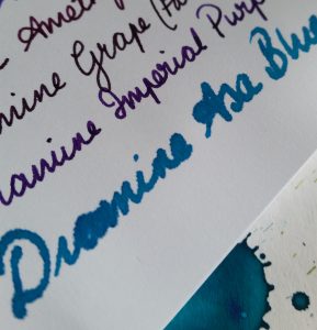
Pelikan P405 fountain pen, gold EF nib, with Diamine Imperial Purple ink
Vintage Waterman fountain pen, flexible italic nib, with Diamine Asa Blue ink
The Tombow Mono Twin is a permanent, solvent-based ink, which I expected to go through the paper. You would be hard pushed to find through which the Mono Twin wouldn’t bleed- what I was checking here was how well the notebooks stood up to potential feathering with this pen, so judge the results on that rather than bleed.
The vintage Waterman is a VERY wet writer, so this really tested how well the notebooks could deal with a lot of ink. The results were somewhat surprising.
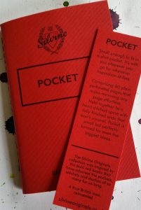
Silvine Pocket
This teeny-tiny notebook is on 110mm x 72mm and 40 pages in size, but is nonetheless an impressive piece of writing kit. They retail for £7.00 for 3 (approx. €8.25 or $9 US). The paper is plain, off-white, and the notebook has a sewn binding.
This unassuming wee notebook was one of the best at standing up to the rigours of the pen test.
None of the pens tested feathered at all, which was impressive. The Mono Twin did bleed through a little but there was no ghosting apart from that.
I’d definitely put Silvine notebooks on my To Buy List, but not this small. I’d be interested in an A5 notebook from this manufacturer if it had the same thick, off-white paper. The tiny pocket would get chewed up in my bag.
The California Back Pocket Journal
California Back Pocket Journal (right)California Back Pocket pen test
These notebooks are slightly smaller than A5 at 88mm x 133mm and have 48 sheets, and a sewn (pamphlet stitch) binding. They’re available in lined, blank (as here), dot grid, graph, or a mixture of plain, lined, and dot grid, and are 3 for £10.50. The paper is 105gsm HP paper which is incredibly smooth.
The paper feels lovely, and handled everything except the very wet vintage nib, which, as you can see, feathered terribly and bled through the page. The bleed through on this was even worse than that of the Mono Twin. This was by far the worst result for the Waterman, which is surprising when everything else fared so well. There was hardly even any ghosting.
The Waterman result aside, this is a nice little notebook.
California back Pocket detailCalifornia back Pocket verso
Another California Back Pocket: Tomoe River Paper
This appears almost identical to the previous, except it contains glorious Japanese Tomoe River paper. This is ivory-coloured and very thin, but can take just about anything a fountain pen can throw at it. I used a Hobonichi diary last year which was made from Tomoe River paper and have been a big fan ever since. It’s definitely worth the hype. Three of the California notebooks retail at £14.
The test results for this notebook are not at all surprising: no bleed through except for a small amount with the Mono Twin; no feathering; some ghosting due to how thin the paper is. The latter will bother some people but I don’t mind it. Tomoe River paper is a pleasure to write on.
Inky Fingers
This is the same size as the California notebooks, but has a coated cover which is a little stronger. It consists of 44 sheets of environmentally-friendly and sustainable wheat straw paper. It feels a little like recycled paper, having more texture than the other papers reviewed here, but doesn’t have the drawbacks of feathering and bleeding usually associated with recycled paper. The paper is white with very subtle specks, and the notebook is staple-bound.
This is a nice notebook, but at £6 each, they’re pricey. For my money, I’d rather get a Tomoe River notebook for £4.67, though I appreciate the environmentally-sustainable way the Inky Fingers notebooks are made.
The lines are narrow at 6mm, which I like. The lines are made of micro-dots which is a nice detail.
Also available are a blank notebook, and a Currently Inked Log book for the same price.
Clairefontaine 1951 Retro Nova
French company Clairefontaine make a variety of notebooks and jotters, supplying a lot of French schoolchildren with their classroom needs. They’re a favourite manufacturer of mine because of their high-quality paper, wide range, and good prices.
The Retro Nova is marginally bigger than the previous notebooks at 88mm x 140mm with 64 smooth ivory pages, and a sewn binding. They are 3 for £8, which is a stone cold bargain. Each of the three has a different cover pattern too. The one pictured here is “novelle vague.”
The pen test showed just how good Clairefontaine paper is. There was no feathering, minimal ghosting, and only the infamous Mono Twin bled through.
Story Supply Co.
Beneath a plain exterior decorated only by the Story Supply co.’s cheerful, retro logo, lies a solid little notebook. It’s 90mm x 140mm, with 48 pages of staple-bound, off-white paper. I tested the lined notebook, which has 5mm spacing. This retails at 3 for £11.
I wasn’t familiar with this company before, and was pleasantly surprised by how well the paper dealt with all of the pens. There was no feathering, little ghosting, and only the Mono Twin bled through (though there were slight hints of almost-bleeding through from the Waterman).
I liked this notebook a lot, but if pushed would have to state a preference for the Clairefontaine above. The Story Supply Co. paper is not quite as good, and it’s an extra £1 per notebook, for an inferior binding.
Darkstar Nomad
This is a differently sized notebook at 100mm x 140mm, so it looks a bit squarer than the others. It has 56 pages of white, dot grid, 100gsm paper and is staple-bound. Interestingly, the ‘dots’ are tiny crosses. These cost £8 for 3.
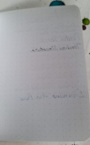
The Darkstar handled most of the pens well but the Waterman and even the Pentel Touch (which is also a wet writer) both feathered slightly. The Mono Twin and the Waterman bled through the paper, though the ghosting wasn’t bad at all.
Final Thoughts
This was a really interesting set of notebooks and I’m very grateful for the chance to test them all. My favourites were the Clairefontaine and the California Tomoe River. The Clairefontaine is the ideal combination of high quality and good value. The Tomoe River is a higher price for a specialist product that some people (like me) will love but may find the ghosting and long ink-drying times a frustration.
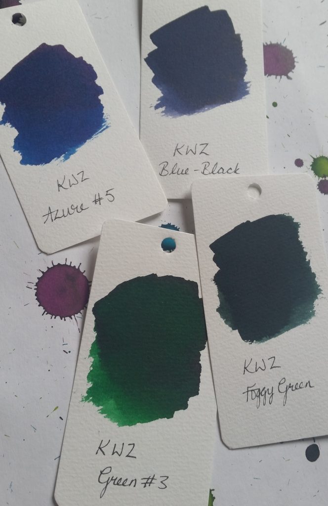
I delightedly receivved some samples of KWZ ink from the lovely people at Pure Pens as part of a meta-review for United Inkdom. KWZ inks are made by Chemistry PhD student Konrad Żurawski in Poland and come in a variety of colours and types, including iron gall and waterproof varieties. I’m reviewing some green and blues here.
KWZ blue and green inks
Azure #5
Test of Azure #5 with glass dip pen
Azure #5 is surprisingly dark for the title “azure” but it’s a lovely, saturated dark royal blue. It reminds me of Diamine Majestic Blue but without the red sheen. It’s definitely a colour that you could use for more formal situations where a restrained, but still a little interesting, ink is called for. It’s a nice, wet ink, but I don’t see it replacing Majestic Blue for me.
KWZ Azure #5 swab on watercolour paper
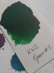
Green #3
KWZ Green #3
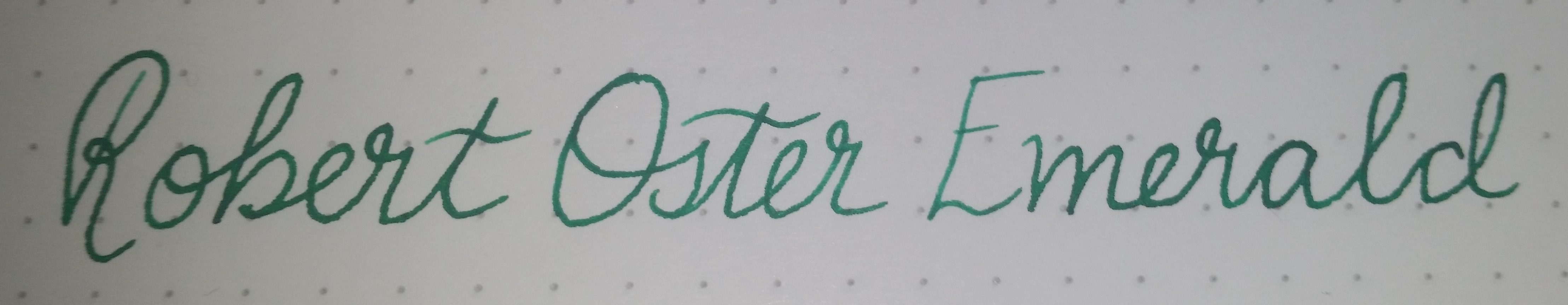
Again, this is a nice, solid dark-ish green without sheen. There’s some nice shading with it, and it’s free-flowing and wet. It’s not hugely exciting though. It’s a little darker and less blue-toned than Robert Oster Emerald, as you can (hopefully!) see from the side-by-side below.
KWZ Green #3Robert Oster Emerald
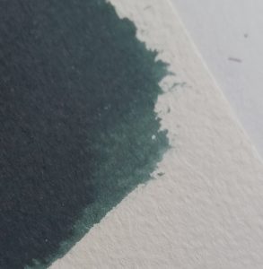
Foggy Green
KWZ Foggy Green
Foggy Green is a far more unusual ink than the previous two. It’s difficult to describe, and I suspect the pictures don’t convey how it really looks. Even the name doesn’t suggest, to me at least, the real colour. It’s a very dark green, with a grey rather than black tone. The written sample (using a glass dip pen) is very dark, but still definitely grey-green rather than black. The grey tone is more apparent in the swab below, and is what stops it seeming black.
KWZ Foggy Green swab on watercolour paperKWZ Foggy Green: close up
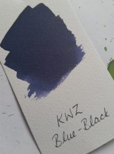
Blue-Black
I’m not a blue-black fan. I’ve tried a few (Diamine Twilight, Pelikan Edelstein Tanzanite) but can’t quite get on board. I like my blacks to look like the staring void. I like my blues bright and interesting. Blue-blacks are the worst of both worlds. However, I was pleasantly surprised with KWZ Blue-Black.
KWZ Blue-Black
Like Foggy Green, it’s a grey-toned colour, but very dark in the glass pen writing sample. The colour of the swab shows the lovely shading of this ink best.
KWZ Blue-Black
My one concern about KWZ inks is the smell, though. Foggy Green and Blue-Black in particular smell very strongly. It disappears by the time the ink dries on the paper, but the wet ink reeks. Even just opening the sample bottles (which contain about 4ml of ink) releases a horrible chemical smell. It’s a strange, plasticy, synthetic smell that lingers for a few minutes after filling the pen. It’s off-putting, but at least it doesn’t last.
The explosion of interest in bullet journals which I’ve spoken about before, shows no sign of slowing in 2017. The new year encourages many people to turn over a new leaf, and for many this means getting organised. The hundreds of beautifully decorated pages on #bulletjournal. I’ve said before, and I still agree, that it’s a bullet journal if you say it is, and it doesn’t have to fit someone else’s predefined idea. If the inventor welcomes lots of variations, then Sue on that bujo Facebook group you joined doesn’t get to say otherwise.
However, as I adapt my own bujo system, I find myself thinking of it in different terms. In my other life, I’m a historian, and so it won’t surprise anyone to hear that I tend to think about things in historical terms. A little bit of research reveals that there are some fascinating predecessors to the bullet journal, reaching as at least as far back as ancient Rome.
Bujos of the Past
Romans kept notes of ideas, maxims, quotations and so forth, and called these collections locus communis. Emperor Marcus Aurelius himself kept one, and it became his Meditations. From the third century, the Chinese kept biji, which were similarly collections of notes. These ancient practices led, eventually to the Italian zibaldone, which were the basis for commonplace books and later, bullet journals.
Zibaldoni
The genre really came into its own in the thirteenth century, when Venetian merchants started keeping notebooks with them on their travels and at home. They recorded their trading activities, but also notable events and experiences, in their zibaldoni (zee-bal-done-ee). Zibaldone (singular) means “heap of things” and indicates that these books were used as receptacles for any and all information and reminiscences that the author wanted to keep track of. An early example is the Zibaldone da Canal, dating to 1312.
Zibaldone Da Canal, Venice 1312 (Beinecke Rare Book and Manuscript Library, Yale University)
Importantly, these books were written in the vernacular, meaning that they were for everyday use and not intended as formal documents (which would have been in Latin). In Florence, and other Italian cities, people kept ricordi (records), and libri segreti (secret, or private, books chiefly but not exclusively concerned with business information). In these books, people (almost always men) recorded business transactions, family births and deaths, observances of city life and political events technical information, indeed anything the author might want to refer to again later. Writers put these books together in no particular order, piling content in as and when it appeared. These books have provided highly important for historians. Giovanni di Paolo Rucellai, a fifteenth-century Florentine wool trader and statesman, was one of the most important keepers of a zibaldone. Not only does his book tell us about conducting business in the Renaissance, but it bears witness to the rise of the Medici and huge changes in civic government.
Commonplace Books
These Italian merchants brought their books to the foreign cities they traded with, and they caught on. By the eighteenth century, they were known in English-speaking countries as commonplace books, a translation of the Latin locis communis. Many notable people kept them: Thomas Jefferson, Jane Austen, H. P. Lovecraft and Napoleon, for example. A few have been published, like that of H. P. Lovecraft.
Zibaldone Lucchese, Abbot Jacopo Chelini (1748 – 1824), Archivio di Stato di Lucca
People filled their zibaldoni and commonplace books with all sorts of things: reflections on events, personal and political; recipes; business information; quotations; drawings and illustrations; letters; poems; reference tables, for example of weights and measures; proverbs and prayers.
Zibaldone Today
Today’s bujos record a huge variety of things. While I don’t usually track tv series I’m watching, I did track watching episodes of Murder One while I was doing archival work in Florence. Jane Austen may not have done this, but when we track and record things in our bujos, we’re taking part in a tradition that goes back far further than we tend to think.
Bullet journals, like zibaldoni and commonplace books are not diaries. They are not necessarily chronological, but they fulfil many of the functions of diaries. Like diaries, they work in two ways. They look both forwards (planned events and appointments) and backwards (when we record what actually happened). We keep track of our scheduled tasks and appointments in weekly or monthly spreads. We record things that happened without planning, in the form of general reflections or specific spreads. Gratitude logs are a popular way of marking things for which we were grateful each day. Historic zibaldoni and commonplace books tended to do much more reflection than planning, but the two are very much compatible. The bujo index helps out with locating information amid the hodgepodge.
I love the idea of renaming my bujo to acknowledge this long tradition. I kind of hate the abbreviation “bujo” anyway, even though I use it out of typing laziness. It seems increasingly fitting to me to think of my A5 dotted Leuchtturm1917 as a modern zibaldone (I study late medieval Italian history- I was hardly going to go for the English phrase!). I very much doubt it will ever of of as much interest to future generations of historians as that of Giovanni Rucellai. But that’s ok.
Commonplace book, Beineke Rare Books and Manuscripts, Yale
There’s been some buzz around Robert Oster inks recently. Made in Australia, they’ve been difficult to find in Europe and North America until recently. In the UK, you can buy them from Izods Ink, who kindly sent samples for this and the other reviews for United Inkdom.
I received Claret and Emerald to review. I’ll confess that when I first received these ink samples, and did a quick swatch of each to get an idea of the colours, I was underwhelmed. Both of them seemed dull and lacking vibrancy. I had hoped that the Emerald would be a bright, dark green, and the Claret a rich red purple. The swatches showed an unexciting dark green, and a dark, greyish purple. Revisiting them a few days later, and creating new swatches, I find I’ve warmed to them a little.
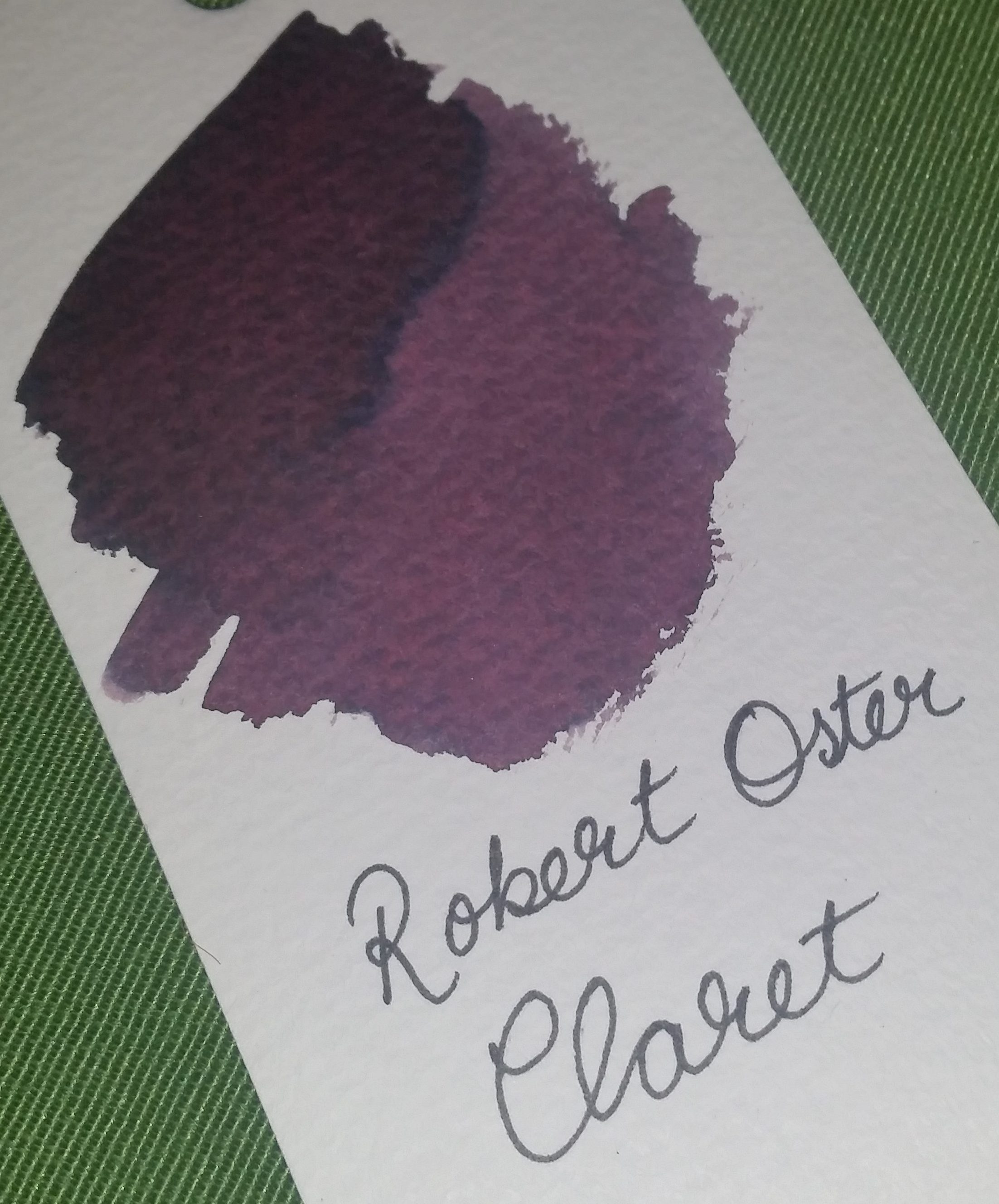
Robert Oster Claret
Robert Oster Claret swatch
Of the two, I was most keen to try Claret. I always like purples and dark reds, and I hope this would fall into both categories.
It’s dark indeed, and has some depth. I didn’t seem any shading when I tested it with a glass pen but you can see there’s quite significant variance in colour from the swatch. I bold- or stub-nibbed fountain pen might make this clearer.
Robert Oster Claret writing sample
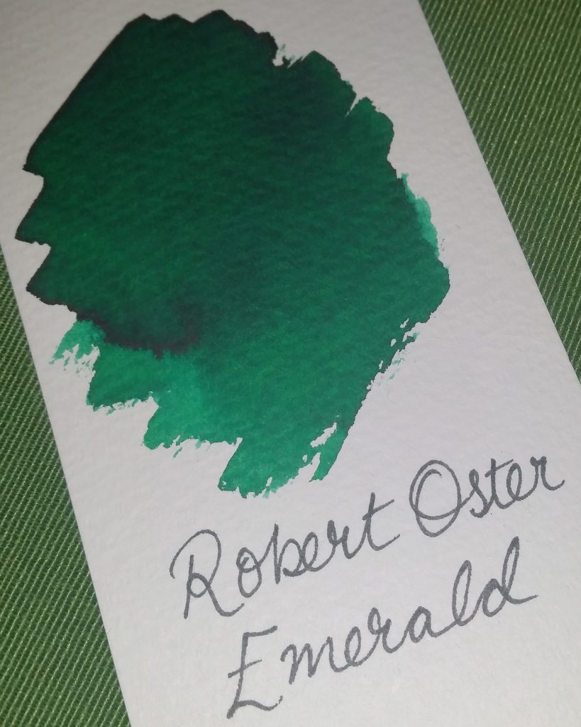
Robert Oster Emerald
Emerald has really grown on me. Although I didn’t find it very exciting at first, on my second look at it, I appreciate the richness and jewel-tones of this ink. As you can see from the photo, there’s a huge variation in the colour: from bright green to almost black. As with the Claret, this wasn’t visible with the glass pen, but will be with a fountain pen using a broad or stub/italic nib. Anything which puts down a lot of ink should show this shading.
Robert Oster Emerald writing sample
Verdict
These are nice inks, and have great shading potential. The Claret is a little unexciting, but the Emerald is lovely. I can see me using both, though I doubt I’d buy Claret as Diamine Grape and Tyrian Purple, and Pelikan Edelstein Amethyst cover all my dark purple needs. I don’t have anything quite like the Emerald though, so that’s one I’d consider. The other United Inkdom reviews show that the Robert Oster teal and turquoise inks are pretty special- and I am keen to try out Fire and Ice which looks pretty special.
[Please excuse the rather dark pictures. It’s been a very dark and gloomy weekend in Edinburgh and there’s just not been enough natural light to take good photos!]
Calligraphy and lettering is big news at the moment. Instagram is full of gorgeous photos and videos of beautiful writing. As a long-time advocate of writing by hand, I’ve watched the craze grow with interest, and harbour hopes of someday improving my own skills in this department. The simple fact is that to improve, you need to practise, practise, and practise some more. It’s a time-intensive hobby and in the final year of my PhD, I just don’t have the time to spare. Perhaps in 2018!
I do, however, love to browse calligraphy and hand lettering books at the bookshop. One that caught my eye is Nib + Ink: The New Art of Modern Calligraphy* by Chiara Perano of Lamplighter London. I was delighted to receive a review copy from United Inkdom. It’s a beautiful book and one which has been produced to high standards. The paper is thick and the illustrations plentiful.
Pros
Perano’s elegant and important illustration showing how to hold the pen
Perano’s illustrations of nibs, pen holders, and most importantly how to hold a pen, are clean and deceptively simple. Lovely nib icons litter the book.
The text is cheerful and encouraging. It’s aimed at beginners and covers all the basics, from where to find supplies, to how to choose which nib to work with. Perano lists suppliers at the end, for both the UK and international markets.
There are guidelines available for free from Perano’s website, and I always appreciate these little content upgrades.
The book is peppered with tips on how to get the most out of your practise, and how to improve your calligraphy.
There are lots of examples to copy, adapt, and use as springboards for your own style.
One of the biggest pluses of this book is that although there is a focus on practice and repetition, Perano is really teaching how to develop your own style. Each letter page has several variations in both the upper and lower cases, which encourages the reader to experiment with each letter.
This is a lovely book, and as I mentioned, the publisher didn’t skimp on production. The paper feels heavy and I think it would take calligraphy ink well if you wanted to practise in the book itself. However, for my money, I’d rather print guidelines onto marker/layout paper and practise on that. That feels like a more economical way to do it, and one where I wouldn’t feel like I’d spoiled this beautiful book with my novice scratchings.
Cons
Letter A exemplars
The variations on each letter are not wide. There are three variations per letter, none of which is vastly different from the other two. Although she advocates developing your own style, if this book is the only one you use, your style is likely to be pretty similar to Perano’s. If you want something more classical, this is not the book for you.
There are a couple of things which Perano skips over which, in a book aimed at beginners, deserved a little more attention. The thing which struck me the most was that she mentions, very briefly, making your own ink using paint, gouache or acrylic. There isn’t really enough information to help you do this- you would have to look online for proper details. She doesn’t mention that if you use acrylic paint, you need to clean that off your nib before it dries or risk ruining the nib.
It depends…
Simple wreaths take up a page eac
This particular issue will depend on how you use the book:
As a result of the intention that you practise in the book, there are a lot of blank pages (more accurately, pages with only guidelines printed on them). I mean A LOT of those pages. By my calculation, fully half the book is blank like this. Each letter page, like the one in the picture above, is followed by a guidelines page, and there are more than ten more double spreads of only guidelines.
If you want to practise in the book, this is useful, but even this amount isn’t enough to level up your skills. You’ll still need to print more (or at least print one sheet to use as a guide underneath your practice paper). This didn’t seem well thought out. If you don’t want to “spoil” the book, then there’s 80-odd pages of wasted space. If you do want to practise in the book, then there’s nowhere near enough.
There is additional “wasted” space at the end, when some fairly simple illustration elements are given entire pages to themselves. I’d have been on board with this if the designs were more complex and merited a closer look, but they seem pretty straightforward.
Conclusions
It’s difficult to come to a decisive conclusion on this book. I like so many aspects of it. I especially like the encouragement to develop your own style and not just to copy Perano’s. It’s a very positive. However, I feel, ultimately, that it lacks depth and variation. I can’t help feeling that all that empty space is an attempt to make up for a lack of content.
*Affiliate link: if you purchase through this link, I will earn a tiny commission at no extra cost to you.
The Bullet Journal is enjoying huge popularity at the moment. Although Ryder Carroll unveiled his idea several years ago to great success, something’s happened in the last few months to propel his system into the public eye. Buzzfeed has runseveralarticles about it too.
What is a bullet journal?
Counting down my remaining time in Italy doing PhD archival research
First thing’s first. Check out Ryder’s website. He created and refined the system and all credit is owed to him. There’s a great wee introductory video on his site and it’s the best place to start. Go check it out now. I’ll wait- it’s not long.
Ok. So now you know the system in its purest form. As you can see from bulletjournal.com though, there are so many ways you can adapt and customise it to suit your own circumstances and requirements. Check out #bulletjournal on Instagram and you’ll see lots of variations. (But do that later because there are currently nearly a quarter of a million photos there!)
What kit do I need?
Notebook and pens (with optional penholder)
A notebook of some kind and a pen of some kind.
Whatever notebook and pen(s) you choose are up to your tastes and funds. I use a Leuchtturm dotted A5 notebook which is a popular choice for bullet journaling because of the good quality paper, low price, and range of colours. You can use anything though.
Moleskine notebooks are also popular but the paper is inferior to that of the Leuchtturm and it won’t take fountain pen ink so it’s not an option for me. Should Moleskine ever up their paper game I’d be all over them- they have a great range of sizes and styles, though I think they’re over-priced.
If you like spiral-bound notebooks, use one of those. If you want to try the system out in a cheap school-style jotter, go for it. Already using a Filofax? You can create a bullet journal right there. You can even add it to your existing planner or diary if there’s a little space for it.
These are lovely but you DO NOT NEED them.
Use whatever pens you like. I love fountain pens so I use those. Pilot Frixion pens are erasable so you won’t have ugly scoring out when things inevitably need rescheduled. Pencils are even more erasable, so use those if you like them. That scabby old ballpoint you picked up from who knows where? If you like it and it works, use it!
Whatever you choose, DO NOT get hung up on getting the “right” supplies. You don’t need washi tape. You don’t need all 6892 colours of Staedtler Triplus Fineliner or all 3 packs of Zebra Mildliners imported from Japan.
My adapted bullet journal system
Counting down the alarmingly few days until my thesis submission
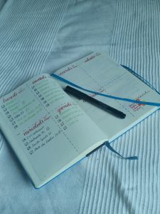
The starkness of Ryder’s system doesn’t work for me. I prefer something more visual- boxing off lists and days and months, and so forth. I like to have a bit of colour in mine and I prefer ticking off boxes to crossing out bullets.
Along with the usual things (appointments, social events, etc), I also have some more unusual things to track. There’s my thesis: the most important thing. There’s also my blog, a part-time job, university tutoring, and some freelance work. I use monthly and weekly spreads to help me with these. Some of the detail (such as my train times) goes on Google Calendar instead. This is purely to keep things from getting too cluttered. It doesn’t make a significant difference to my planning if I get one train or the next one, so I don’t put it in my bullet journal. However, I do need to know if I have a ticket that’s only valid for a certain train, so I put that on Google Calendar and get a electronic reminder.
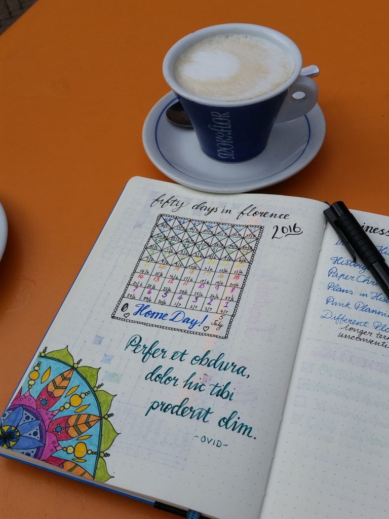
I also like countdowns so I use my bullet journal for these. For example, I have one that counts down to my PhD submission. I used another to count down the time I had left in the archives when I was doing my research in Florence.
Is it still a bullet journal if I adapt it?
This is a weekly spread I used when doing fieldwork in Italy
There have been debates online recently, some needlessly heated, about whether or not the more ornate versions are still bullet journals. I use ticky boxes instead of bullets, so perhaps mine isn’t a bullet journal at all. It really doesn’t matter. I think the only person who has any right to decide if something is a bullet journal or not is Ryder, the inventor, and he seems quite happy to feature non-traditional, adapted, and ornate versions on his site.
I also think that the name we give a system is barely even a secondary concern compared to the key question: does it work for you? There’s no sense in moving from a colourful, decorated planner which works for you to a minimalist one in order to conform to what puritans think is the only way to bullet journal (or vice versa). If someone wants to tell you that you have deviated too greatly from canon and you have no right to call what you have a bullet journal then, meh. Something has probably gone a bit wrong in that person’s life that they are getting upset over the nomenclature of someone else’s to do list. Be kind to the poor wee scone, but ignore them.
Why handwriting is a much better way to take notes and why typing them is old fashioned
It’s the start of the new academic year and one of the first things I tell my undergraduate students is to take notes by hand with paper and a pen. Some of them already do this but others peer at me over their laptop screens as if I had suggested eating light bulbs as a study strategy. It sounds old fashioned, as if it’s my personal last ditch attempt to hold back the tide of technology and preserve something pointlessly out-dated, like the penny farthing or whalebone corsets. But handwriting is a much better strategy for anyone taking notes.
This idea isn’t just a quaint idea. The physical act of handwriting, moving a pen across the page, has significant benefits over tapping a keyboard to record the same information. Researchers have shown that writing with a pen and paper uses different parts of the brain from typing. Several studies conducted in recent years support what stationery enthusiasts have known for a long time. Writing by hand increases engagement with, comprehension, and retention of information.
Benefits of Handwriting
Writing by hand is slower, which is often seen as a problem. If we can type a lecture verbatim surely that’s better than writing notes on it on a notepad? Well, no. A recent study showed that students writing notes rather than typing understood more because writing forced them to be selective in what they took down. This extra mental step helped them engage and remember the material better than those who just typed it all out, despite the latter having taken far more notes. This was true in tests immediately after the lecture and when subjects were tested a week later.
Laptop note-takers
The proliferation of laptops and tablets, and widely available free wifi has encouraged us to multitask. Handwriting forces us to focus. It doesn’t tempt us to keep Facebook open in another tab and quickly check it when the lecturer takes a breath. Other studies show that students with laptops can spend 40% of class time on unrelated applications and are consequently less satisfied with their education. I’m sure something similar is true beyond the classroom too- in business meetings, for example.
Instead, handwriting makes us engage with what we’re working on. There’s no battery to worry about or pop-up notifications vying for our attention. We have to concentrate, sift and summarise. Surprisingly, laptop note-taking is a lot like learning by rote in a Victorian schoolroom. Like laptop note-takers, Victorian children would have been able to recite dates and names, lists and times tables, but may not have been able to apply or understand the material very well.
What To Do
Many people are reluctant to shift to handwritten note-taking because their handwriting is less beautiful than they would like. Perhaps they struggle to read it again later, or are embarrassed for others to see it. I get that. My own writing isn’t as lovely as I would like. For most people though, that can change. Regular practice will improve your handwriting as it does for most skills. Simply, the more you do it the better you will get at doing it. Conscious practice will improve it even more (I’ll talk about conscious practice another time). A useful tip for taking notes from books (rather than in lectures) is to slow down. Most of use write untidily because we rush and don’t take the time to form letters properly. You don’t have to go at a snail’s pace, but if you slow down even a little, it will help.
Also, if you use a program like Evernote to digitise your handwritten notes it will have a bash at making your scrawl searchable. It valiantly tries to make my photographs of Italian renaissance manuscripts searchable, and while I can’t say it’s mastered them, it’s unlikely your writing is less legible than the scrawl of a fifteenth-century Florentine notary!
This post contains affiliate links, which means that if you click on one of the product links, I’ll receive a small commission at no cost to you. For example, if you follow the Evernote link, you can get a month’s Premium subscription free and if you decide to create an account, Evernote will give me a month’s Premium subscription free too.
I was excited to receive four bottles of Diamine’s new Shimmertastic inks to review. This is part of a meta-review from United Inkdom.
I was sent:
Shimmertastic Ink swatches
Golden Oasis
Tropical Glow
Blue Flame
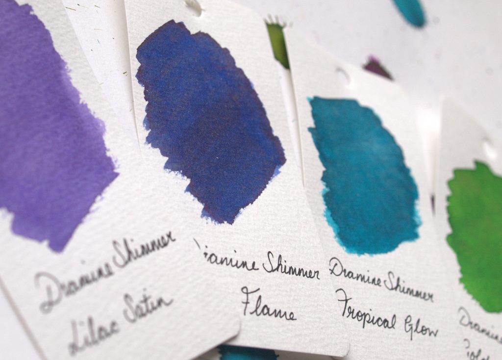
Lilac Satin
I was particularly happy to get my hands on Tropical Glow, as I love teal and turquoise inks, and Golden Oasis as I am also very fond of this shade of green.
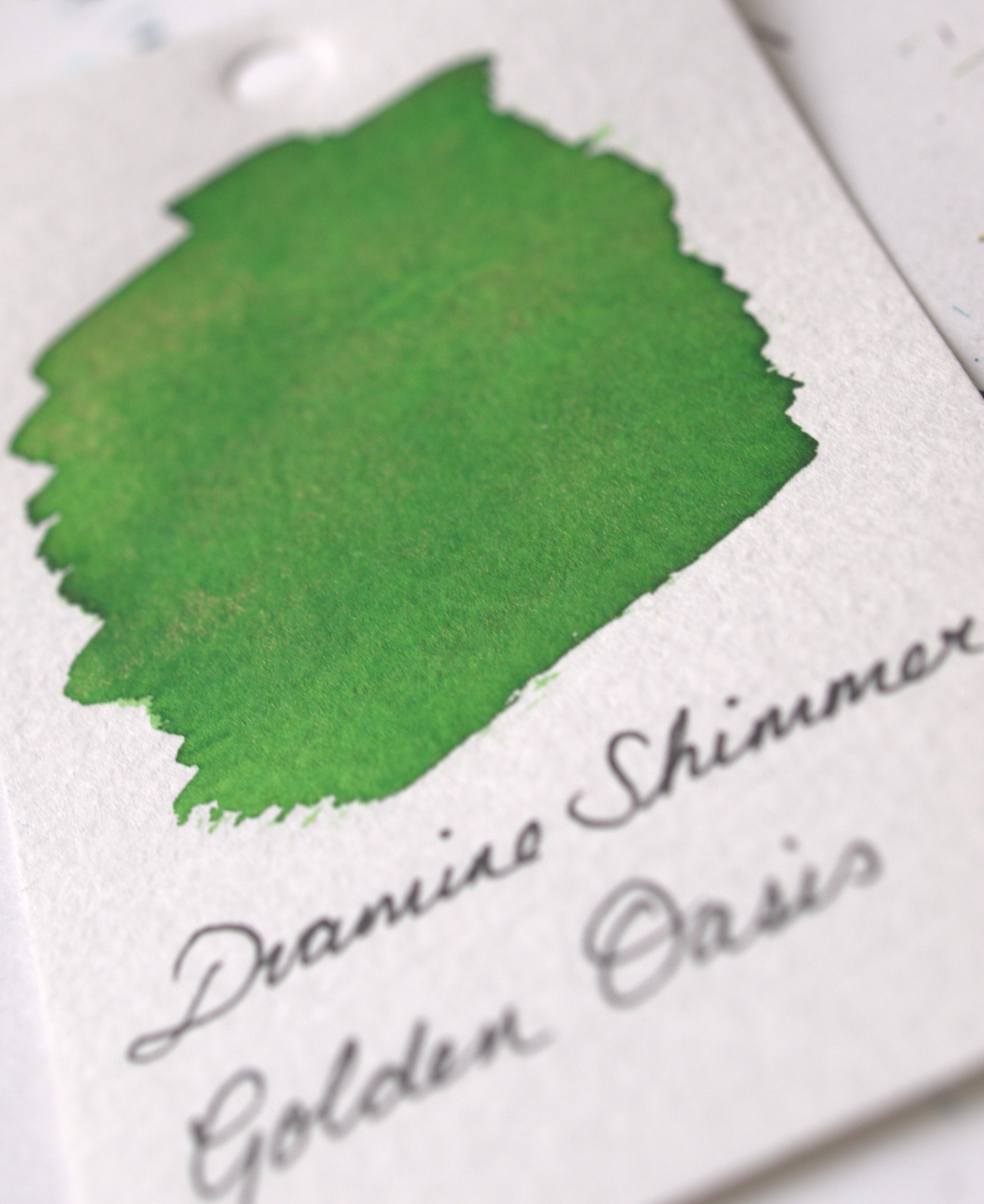
Golden Oasis
This is a mid-green with golden shimmer. It proved to be one of my favourites of this set. It’s a cheerful, leafy green which isn’t a million miles away from Diamine Meadow. The golden shimmer is subtle but visible. The particles are very fine and a gentle agitation is all that’s required to stir them up if the pen has been lying unused for a while.
Golden Oasis swatch
It’s difficult to capture the sparkle of this ink with a camera, especially in Scotland in late December when there’s not a whole lot of natural light to reflect.
Gold particles visibleGolden Oasis on Tomoe River Paper from a Hobonichi Techo Cousin diary
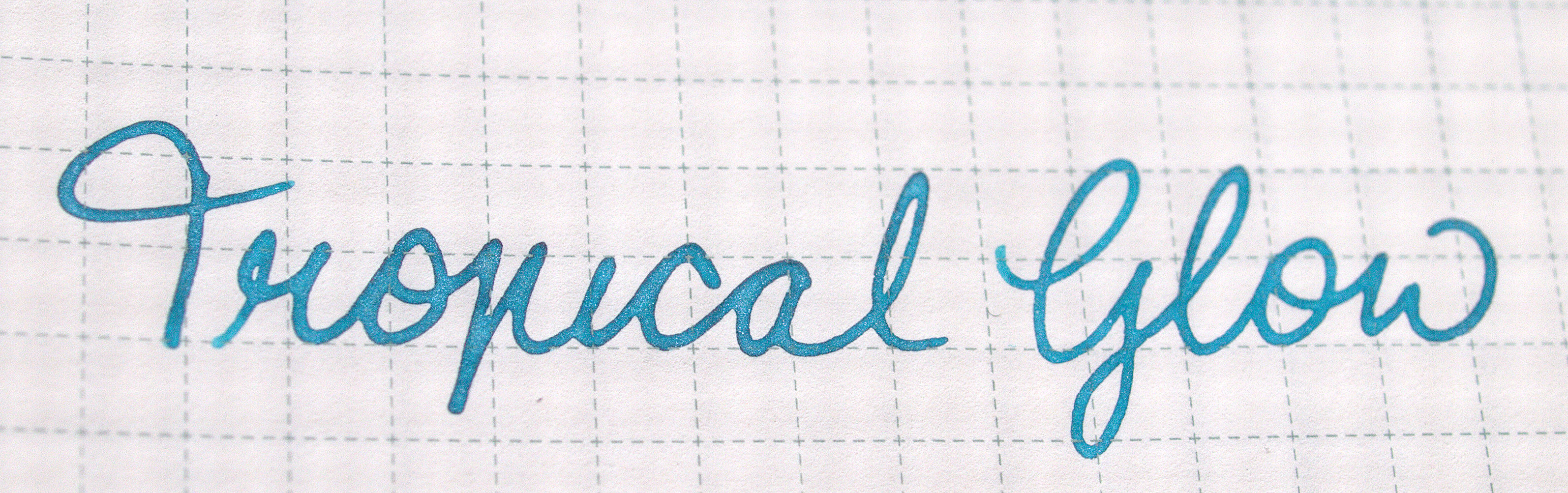
Tropical Glow
This is a beautiful deep turquoise ink with silver sparkle. The ink alone is almost identical to Diamine Marine, my favourite every day ink. It’s brighter than Yama Dori and without the amazing sheen of that ink, but as a result is a more usable ink. The silver shimmer, like the gold, is fine but catches the light well.
Tropical Glow swatchSilver sparkle in Tropical Glow
Tropical Glow on Tomoe River Paper
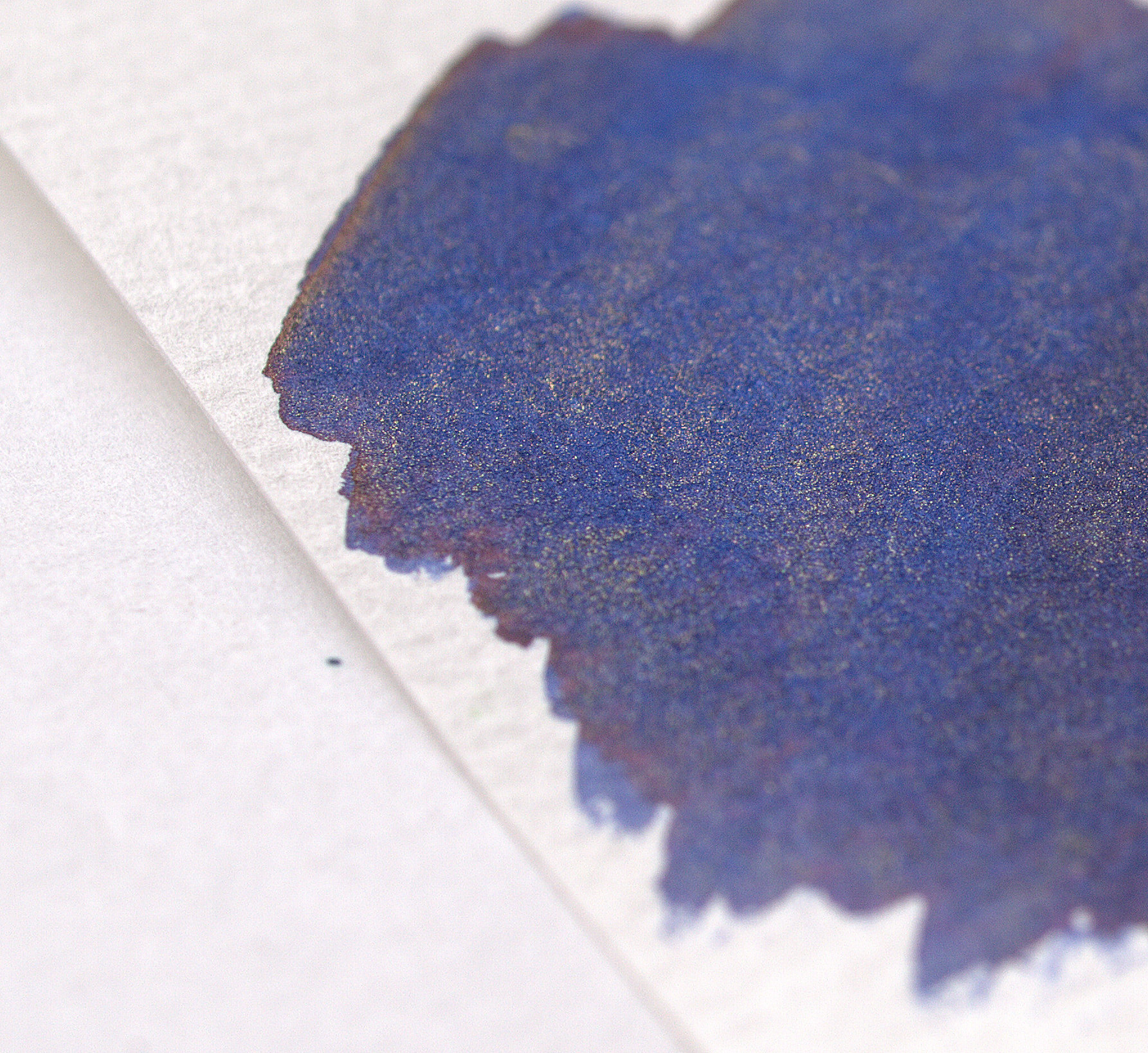
Blue Flame
Blue Flame is a deep blue with gold shimmer with a hint of red sheen. I found it to show the shimmer the best of the four, perhaps because it is the darkest ink and contrasts the sparkle better.
Blue Flame swatchThis looks like a chunk of lapis lazuliBlue Flame on Tomoe River Paper
Lilac Satin
This is a light, bright purple with silver shimmer. I expected to like this more but perhaps it was just that it is too light for me. It is a colour lots of people will love though.
Lilac Satin swatchSilver sparkle in Lilac SatinLilac Satin on Tomoe River Paper
These are lovely inks and I will definitely be investigating some of the other colours in this range. They are not as spectacular as Herbin’s Anniversary inks but they are consequently more usable. They are affordable for everyday use and the sparkle is subtle enough to brighten up your writing without making it look like there was an explosion in a glitter factory. Only Blue Flame showed any sheet and the shading is minimal on all four.