Mega Mini-Notebooks Review

The lovely Stu over at Pocket Notebooks sent some United Inkdom members a bumper pack of small notebooks to review. I received a really nicely presented box containing 6 approx. A6 notebooks, and a tiny wee Silvine.
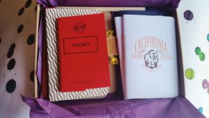
Pocket Notebooks box
Pocket Notebooks box (including a little ‘sweetener’)
Notebooks!
Notebooks!

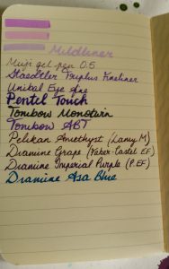
All of these notebooks should be able to handle fountain pens, so I decided to put the manufacturers’ claims to the test with a variety of pens and inks. I selected a variety of purple inks for no particular reason except I like purple. Here are the pens I used:

From bottom to top (the order used in the tests):
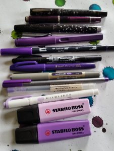
Tester pen selection
The selection of mostly) purple pens used to put these notebooks through their paces
  • Stabilo Boss purple highlighter
  • Stabilo Boss pastel purple highlighter
  • Zebra Mildliner soft purple
  • Muji gel pen (0.5mm)
  • Staedtler Triplus Fineliner
  • Uni-ball Eye (fine)
  • Pentel Touch brush sign pen
  • Tombow Mono Twin
  • Tombow ABT (636 Imperial Purple)
  • Lamy Safari fountain pen, M nib with Pelikan Edelstein Amethyst ink
  • Faber-Castell Basic fountain pen, EF nib, with Diamine Grape ink
  • Pelikan P405 fountain pen, gold EF nib, with Diamine Imperial Purple ink
  • Vintage Waterman fountain pen, flexible italic nib, with Diamine Asa Blue ink

The Tombow Mono Twin is a permanent, solvent-based ink, which I expected to go through the paper. You would be hard pushed to find through which the Mono Twin wouldn’t bleed- what I was checking here was how well the notebooks stood up to potential feathering with this pen, so judge the results on that rather than bleed.

The vintage Waterman is a VERY wet writer, so this really tested how well the notebooks could deal with a lot of ink. The results were somewhat surprising.


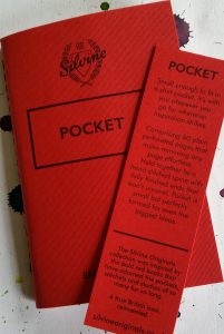
Silvine Pocket
"<yoastmark

"<yoastmark

This teeny-tiny notebook is on 110mm x 72mm and 40 pages in size, but is nonetheless an impressive piece of writing kit. They retail for £7.00 for 3 (approx. €8.25 or $9 US). The paper is plain, off-white, and the notebook has a sewn binding.

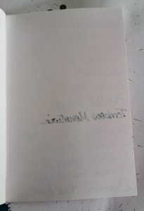
This unassuming wee notebook was one of the best at standing up to the rigours of the pen test.

None of the pens tested feathered at all, which was impressive. The Mono Twin did bleed through a little but there was no ghosting apart from that.

I’d definitely put Silvine notebooks on my To Buy List, but not this small. I’d be interested in an A5 notebook from this manufacturer if it had the same thick, off-white paper. The tiny pocket would get chewed up in my bag.
"<yoastmark

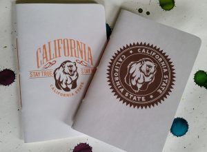
The California Back Pocket Journal

California Backpocket Journal
California Back Pocket Journal (right)
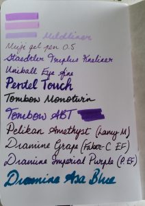
California Backpocket pen test
California Back Pocket pen test

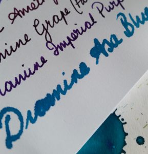
These notebooks are slightly smaller than A5 at 88mm x 133mm and have 48 sheets, and a sewn (pamphlet stitch) binding. They’re available in lined, blank (as here), dot grid, graph, or a mixture of plain, lined, and dot grid, and are 3 for £10.50. The paper is 105gsm HP paper which is incredibly smooth.

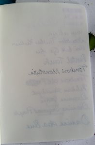
The paper feels lovely, and handled everything except the very wet vintage nib, which, as you can see, feathered terribly and bled through the page. The bleed through on this was even worse than that of the Mono Twin. This was by far the worst result for the Waterman, which is surprising when everything else fared so well. There was hardly even any ghosting.

The Waterman result aside, this is a nice little notebook.
California backpocket detail
California back Pocket detail
California backpocket verso
California back Pocket verso

Another California Back Pocket: Tomoe River Paper

"<yoastmark

"<yoastmark

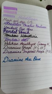
This appears almost identical to the previous, except it contains glorious Japanese Tomoe River paper. This is ivory-coloured and very thin, but can take just about anything a fountain pen can throw at it. I used a Hobonichi diary last year which was made from Tomoe River paper and have been a big fan ever since. It’s definitely worth the hype. Three of the California notebooks retail at £14.

The test results for this notebook are not at all surprising: no bleed through except for a small amount with the Mono Twin; no feathering; some ghosting due to how thin the paper is. The latter will bother some people but I don’t mind it. Tomoe River paper is a pleasure to write on.

Inky Fingers
"<yoastmark

"<yoastmark

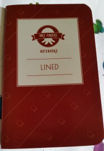
This is the same size as the California notebooks, but has a coated cover which is a little stronger. It consists of 44 sheets of environmentally-friendly and sustainable wheat straw paper. It feels a little like recycled paper, having more texture than the other papers reviewed here, but doesn’t have the drawbacks of feathering and bleeding usually associated with recycled paper. The paper is white with very subtle specks, and the notebook is staple-bound.

This is a nice notebook, but at £6 each, they’re pricey. For my money, I’d rather get a Tomoe River notebook for £4.67, though I appreciate the environmentally-sustainable way the Inky Fingers notebooks are made.

The lines are narrow at 6mm, which I like. The lines are made of micro-dots which is a nice detail.

Also available are a blank notebook, and a Currently Inked Log book for the same price.


Clairefontaine 1951 Retro Nova

"<yoastmark

"<yoastmark

French company Clairefontaine make a variety of notebooks and jotters, supplying a lot of French schoolchildren with their classroom needs. They’re a favourite manufacturer of mine because of their high-quality paper, wide range, and good prices.

The Retro Nova is marginally bigger than the previous notebooks at 88mm x 140mm with 64 smooth ivory pages, and a sewn binding. They are 3 for £8, which is a stone cold bargain. Each of the three has a different cover pattern too. The one pictured here is “novelle vague.”

The pen test showed just how good Clairefontaine paper is. There was no feathering, minimal ghosting, and only the infamous Mono Twin bled through.


Story Supply Co.

"<yoastmark

"<yoastmark

Beneath a plain exterior decorated only by the Story Supply co.’s cheerful, retro logo, lies a solid little notebook. It’s 90mm x 140mm, with 48 pages of staple-bound, off-white paper. I tested the lined notebook, which has 5mm spacing. This retails at 3 for £11.

I wasn’t familiar with this company before, and was pleasantly surprised by how well the paper dealt with all of the pens. There was no feathering, little ghosting, and only the Mono Twin bled through (though there were slight hints of almost-bleeding through from the Waterman).

I liked this notebook a lot, but if pushed would have to state a preference for the Clairefontaine above. The Story Supply Co. paper is not quite as good, and it’s an extra £1 per notebook, for an inferior binding.

"<yoastmark

Darkstar Nomad

"<yoastmark

"<yoastmark

This is a differently sized notebook at 100mm x 140mm, so it looks a bit squarer than the others. It has 56 pages of white, dot grid, 100gsm paper and is staple-bound. Interestingly, the ‘dots’ are tiny crosses. These cost £8 for 3.

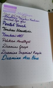
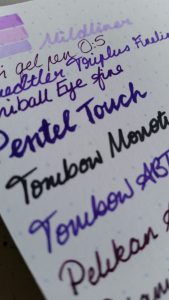
The Darkstar handled most of the pens well but the Waterman and even the Pentel Touch (which is also a wet writer) both feathered slightly. The Mono Twin and the Waterman bled through the paper, though the ghosting wasn’t bad at all.
"<yoastmark

"<yoastmark

"<yoastmark


Final Thoughts

This was a really interesting set of notebooks and I’m very grateful for the chance to test them all. My favourites were the Clairefontaine and the California Tomoe River. The Clairefontaine is the ideal combination of high quality and good value. The Tomoe River is a higher price for a specialist product that some people (like me) will love but  may find the ghosting and long ink-drying times a frustration.

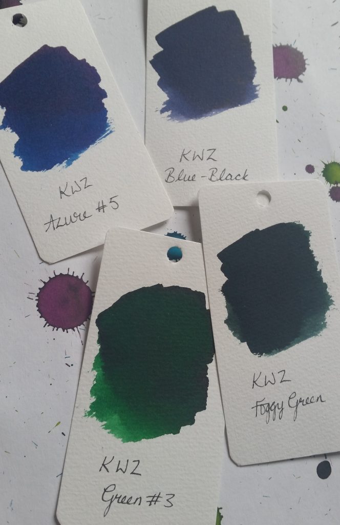
KWZ ink: Azure #5, Green #3, Foggy Green, Blue-Black reviews

I delightedly receivved some samples of KWZ ink from the lovely people at Pure Pens as part of a meta-review for United Inkdom. KWZ inks are made by Chemistry PhD student Konrad Żurawski in Poland and come in a variety of colours and types, including iron gall and waterproof varieties. I’m reviewing some green and blues here.

KWZ inks
KWZ blue and green inks

Azure #5

Azure #5 sample
Test of Azure #5 with glass dip pen

Azure #5 is surprisingly dark for the title “azure” but it’s a lovely, saturated dark royal blue. It reminds me of Diamine Majestic Blue but without the red sheen. It’s definitely a colour that you could use for more formal situations where a restrained, but still a little interesting, ink is called for. It’s a nice, wet ink, but I don’t see it replacing Majestic Blue for me.

KWZ Azure #5
KWZ Azure #5 swab on watercolour paper

Green #3

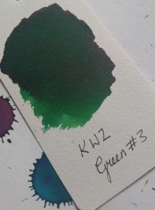
KWZ Green #3
KWZ Green #3

Again, this is a nice, solid dark-ish green without sheen. There’s some nice shading with it, and it’s free-flowing and wet. It’s not hugely exciting though. It’s a little darker and less blue-toned than Robert Oster Emerald, as you can (hopefully!) see from the side-by-side below.

KWZ Green #3
KWZ Green #3
Robert Oster Emerald ink
Robert Oster Emerald


Foggy Green

KWZ Foggy Green
KWZ Foggy Green

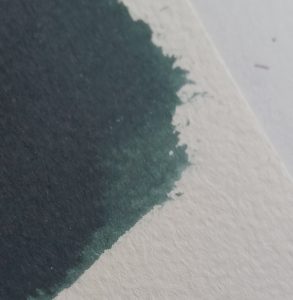
Foggy Green is a far more unusual ink than the previous two. It’s difficult to describe, and I suspect the pictures don’t convey how it really looks. Even the name doesn’t suggest, to me at least, the real colour. It’s a very dark green, with a grey rather than black tone. The written sample (using a glass dip pen) is very dark, but still definitely grey-green rather than black. The grey tone is more apparent in the swab below, and is what stops it seeming black.

KWZ Foggy Green
KWZ Foggy Green swab on watercolour paper
KWZ Foggy Green
KWZ Foggy Green: close up

Blue-Black

I’m not a blue-black fan. I’ve tried a few (Diamine Twilight, Pelikan Edelstein Tanzanite) but can’t quite get on board. I like my blacks to look like the staring void. I like my blues bright and interesting. Blue-blacks are the worst of both worlds. However, I was pleasantly surprised with KWZ Blue-Black.

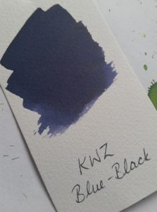
KWZ Blue-Black
KWZ Blue-Black

Like Foggy Green, it’s a grey-toned colour, but very dark in the glass pen writing sample. The colour of the swab shows the lovely shading of this ink best.

KWZ Blue-Black
KWZ Blue-Black

My one concern about KWZ inks is the smell, though. Foggy Green and Blue-Black in particular smell very strongly. It disappears by the time the ink dries on the paper, but the wet ink reeks. Even just opening the sample bottles (which contain about 4ml of ink) releases a horrible chemical smell. It’s a strange, plasticy, synthetic smell that lingers for a few minutes after filling the pen. It’s off-putting, but at least it doesn’t last.

Robert Oster Signature Inks Claret and Emerald review

There’s been some buzz around Robert Oster inks recently. Made in Australia, they’ve been difficult to find in Europe and North America until recently. In the UK, you can buy them from Izods Ink, who kindly sent samples for this and the other reviews for United Inkdom.

I received Claret and Emerald to review. I’ll confess that when I first received these ink samples, and did a quick swatch of each to get an idea of the colours, I was underwhelmed. Both of them seemed dull and lacking vibrancy. I had hoped that the Emerald would be a bright, dark green, and the Claret a rich red purple. The swatches showed an unexciting dark green, and a dark, greyish purple. Revisiting them a few days later, and creating new swatches, I find I’ve warmed to them a little.

Robert Oster Claret

Robert Oster Claret swatch

Of the two, I was most keen to try Claret. I always like purples and dark reds, and I hope this would fall into both categories.

It’s dark indeed, and has some depth. I didn’t seem any shading when I tested it with a glass pen but you can see there’s quite significant variance in colour from the swatch. I bold- or stub-nibbed fountain pen might make this clearer.

Robert Oster Claret writing sample


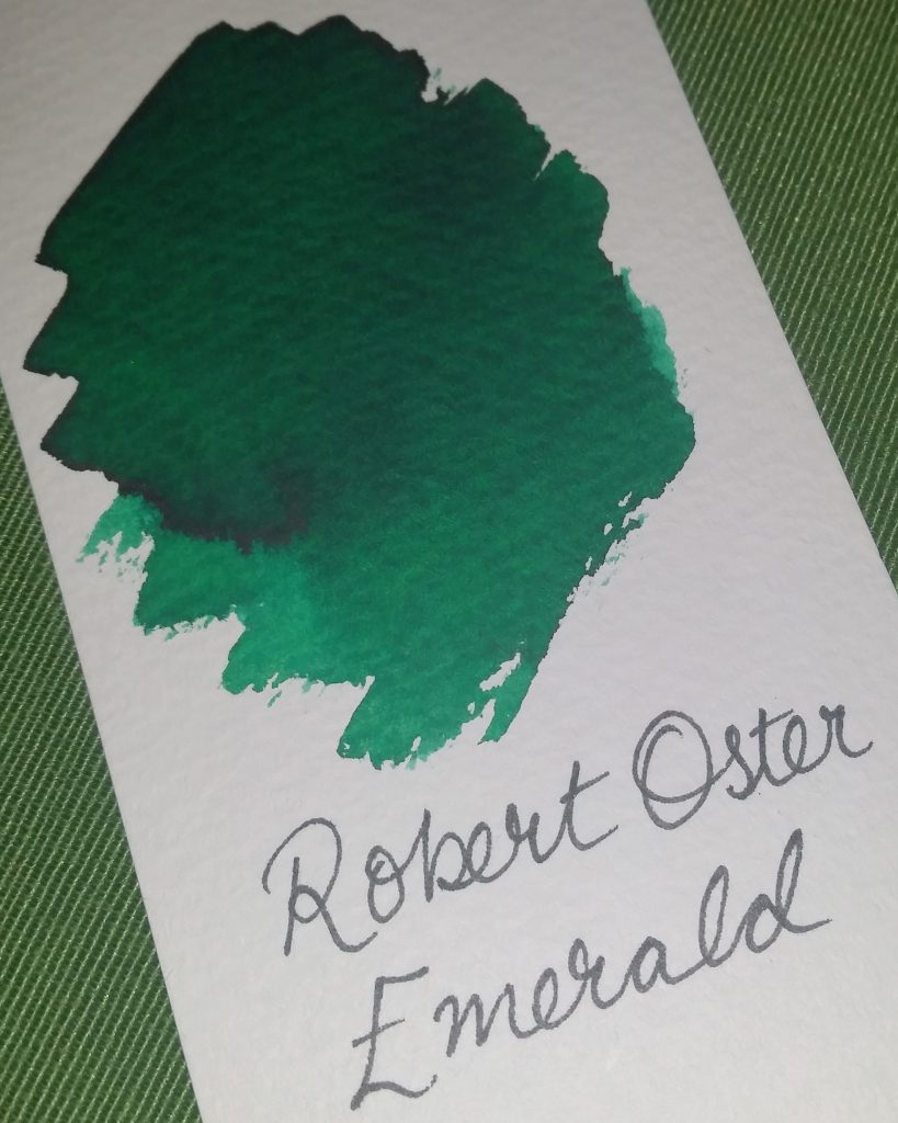
Robert Oster Emerald

Emerald has really grown on me. Although I didn’t find it very exciting at first, on my second look at it, I appreciate the richness and jewel-tones of this ink. As you can see from the photo, there’s a huge variation in the colour: from bright green to almost black. As with the Claret, this wasn’t visible with the glass pen, but will be with a fountain pen using a broad or stub/italic nib. Anything which puts down a lot of ink should show this shading.

Robert Oster Emerald writing sample


Verdict

These are nice inks, and have great shading potential. The Claret is a little unexciting, but the Emerald is lovely. I can see me using both, though I doubt I’d buy Claret as Diamine Grape and Tyrian Purple, and Pelikan Edelstein Amethyst cover all my dark purple needs. I don’t have anything quite like the Emerald though, so that’s one I’d consider. The other United Inkdom reviews show that the Robert Oster teal and turquoise inks are pretty special- and I am keen to try out Fire and Ice which looks pretty special.


[Please excuse the rather dark pictures. It’s been a very dark and gloomy weekend in Edinburgh and there’s just not been enough natural light to take good photos!]

Calligraphy Book Review: Nib + Ink

Calligraphy and lettering is big news at the moment. Instagram is full of gorgeous photos and videos of beautiful writing. As a long-time advocate of writing by hand, I’ve watched the craze grow with interest, and harbour hopes of someday improving my own skills in this department. The simple fact is that to improve, you need to practise, practise, and practise some more. It’s a time-intensive hobby and in the final year of my PhD, I just don’t have the time to spare. Perhaps in 2018!

I do, however, love to browse calligraphy and hand lettering books at the bookshop. One that caught my eye is Nib + Ink: The New Art of Modern Calligraphy* by Chiara Perano of Lamplighter London. I was delighted to receive a review copy from United Inkdom. It’s a beautiful book and one which has been produced to high standards. The paper is thick and the illustrations plentiful.

Pros

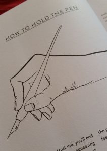
How to hold the pen illustration
Perano’s elegant and important illustration showing how to hold the pen

Perano’s illustrations of nibs, pen holders, and most importantly how to hold a pen, are clean and deceptively simple. Lovely nib icons litter the book.

The text is cheerful and encouraging. It’s aimed at beginners and covers all the basics, from where to find supplies, to how to choose which nib to work with. Perano lists suppliers at the end, for both the UK and international markets.

There are guidelines available for free from Perano’s website, and I always appreciate these little content upgrades.

The book is peppered with tips on how to get the most out of your practise, and how to improve your calligraphy.

There are lots of examples to copy, adapt, and use as springboards for your own style.

One of the biggest pluses of this book is that although there is a focus on practice and repetition, Perano is really teaching how to develop your own style. Each letter page has several variations in both the upper and lower cases, which encourages the reader to experiment with each letter.

This is a lovely book, and as I mentioned, the publisher didn’t skimp on production. The paper feels heavy and I think it would take calligraphy ink well if you wanted to practise in the book itself. However, for my money, I’d rather print guidelines onto marker/layout paper and practise on that. That feels like a more economical way to do it, and one where I wouldn’t feel like I’d spoiled this beautiful book with my novice scratchings.

Cons

Letter A exemplars
Letter A exemplars


The variations on each letter are not wide. There are three variations per letter, none of which is vastly different from the other two. Although she advocates developing your own style, if this book is the only one you use, your style is likely to be pretty similar to Perano’s. If you want something more classical, this is not the book for you.

There are a couple of things which Perano skips over which, in a book aimed at beginners, deserved a little more attention. The thing which struck me the most was that she mentions, very briefly, making your own ink using paint, gouache or acrylic. There isn’t really enough information to help you do this- you would have to look online for proper details. She doesn’t mention that if you use acrylic paint, you need to clean that off your nib before it dries or risk ruining the nib.


It depends…

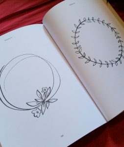
Wreath illustrations
Simple wreaths take up a page eac

This particular issue will depend on how you use the book:

As a result of the intention that you practise in the book, there are a lot of blank pages (more accurately, pages with only guidelines printed on them). I mean A LOT of those pages. By my calculation, fully half the book is blank like this. Each letter page, like the one in the picture above, is followed by a guidelines page, and there are more than ten more double spreads of only guidelines.

If you want to practise in the book, this is useful, but even this amount isn’t enough to level up your skills. You’ll still need to print more (or at least print one sheet to use as a guide underneath your practice paper). This didn’t seem well thought out. If you don’t want to “spoil” the book, then there’s 80-odd pages of wasted space. If you do want to practise in the book, then there’s nowhere near enough.

There is additional “wasted” space at the end, when some fairly simple illustration elements are given entire pages to themselves. I’d have been on board with this if the designs were more complex and merited a closer look, but they seem pretty straightforward.

Conclusions

It’s difficult to come to a decisive conclusion on this book. I like so many aspects of it. I especially like the encouragement to develop your own style and not just to copy Perano’s. It’s a very positive. However, I feel, ultimately, that it lacks depth and variation. I can’t help feeling that all that empty space is an attempt to make up for a lack of content.
 

*Affiliate link: if you purchase through this link, I will earn a tiny commission at no extra cost to you.

Diamine Shimmertastic Inks review

I was excited to receive four bottles of Diamine’s new Shimmertastic inks to review. This is part of a meta-review from United Inkdom.

I was sent:

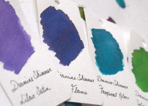
Swatches of four Diamine Shimmertastic inks
Shimmertastic Ink swatches
  • Golden Oasis
  • Tropical Glow
  • Blue Flame
  • Lilac Satin

I was particularly happy to get my hands on Tropical Glow, as I love teal and turquoise inks, and Golden Oasis as I am also very fond of this shade of green.

Golden Oasis

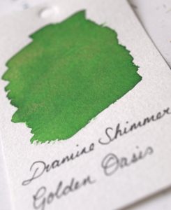
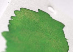
This is a mid-green with golden shimmer. It proved to be one of my favourites of this set. It’s a cheerful, leafy green which isn’t a million miles away from Diamine Meadow. The golden shimmer is subtle but visible. The particles are very fine and a gentle agitation is all that’s required to stir them up if the pen has been lying unused for a while.

Golden Oasis swatch
Golden Oasis swatch

It’s difficult to capture the sparkle of this ink with a camera, especially in Scotland in late December when there’s not a whole lot of natural light to reflect.

Gold particles visible
Golden Oasis on Tomoe River Paper
Golden Oasis on Tomoe River Paper from a Hobonichi Techo Cousin diary


Tropical Glow

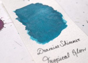
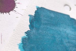
This is a beautiful deep turquoise ink with silver sparkle. The ink alone is almost identical to Diamine Marine, my favourite every day ink. It’s brighter than Yama Dori and without the amazing sheen of that ink, but as a result is a more usable ink. The silver shimmer, like the gold, is fine but catches the light well.

Tropical Glow swatch
Silver sparkle in Tropical Glow


Tropical Glow on Tomoe River Paper


Blue Flame

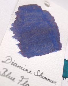
Blue Flame is a deep blue with gold shimmer with a hint of red sheen. I found it to show the shimmer the best of the four, perhaps because it is the darkest ink and contrasts the sparkle better.

Blue Flame swatch
Blue Flame swatch
Blue Flame with golden particles
This looks like a chunk of lapis lazuli
Blue Flame on Tomoe River Paper

Lilac Satin

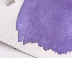
This is a light, bright purple with silver shimmer. I expected to like this more but perhaps it was just that it is too light for me. It is a colour lots of people will love though.

Lilac Satin swatch
Lilac Satin swatch
Silver sparkle in Lilac Satin
Lilac Satin on Tomoe River Paper


These are lovely inks and I will definitely be investigating some of the other colours in this range. They are not as spectacular as Herbin’s Anniversary inks but they are consequently more usable. They are affordable for everyday use and the sparkle is subtle enough to brighten up your writing without making it look like there was an explosion in a glitter factory. Only Blue Flame showed any sheet and the shading is minimal on all four.